Illustration Projects
Emerging Tech Illustration
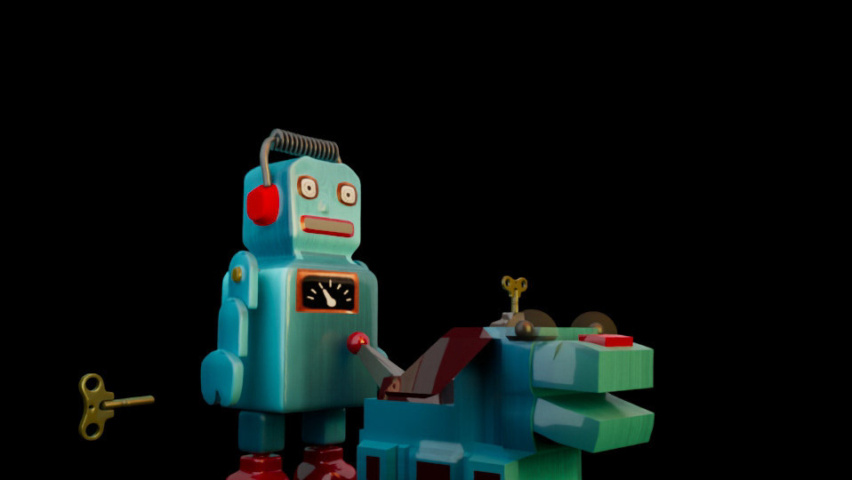
This project aimed to display a strong visual of the combination of robotics and Ai technology and humanity. After researching Ai and graphics that support ai, I designed my piece to show the joint teamwork between humans and machines utilizing Balance, Unity, Color theory, and Space to emphasize the connection between each part. I wanted to dispel the negative stigma Ai usually receives while keeping a clean and friendly design.

"Emerging Technology- Illustrator 2024, 1640 x 1200 pixels
Brain Log
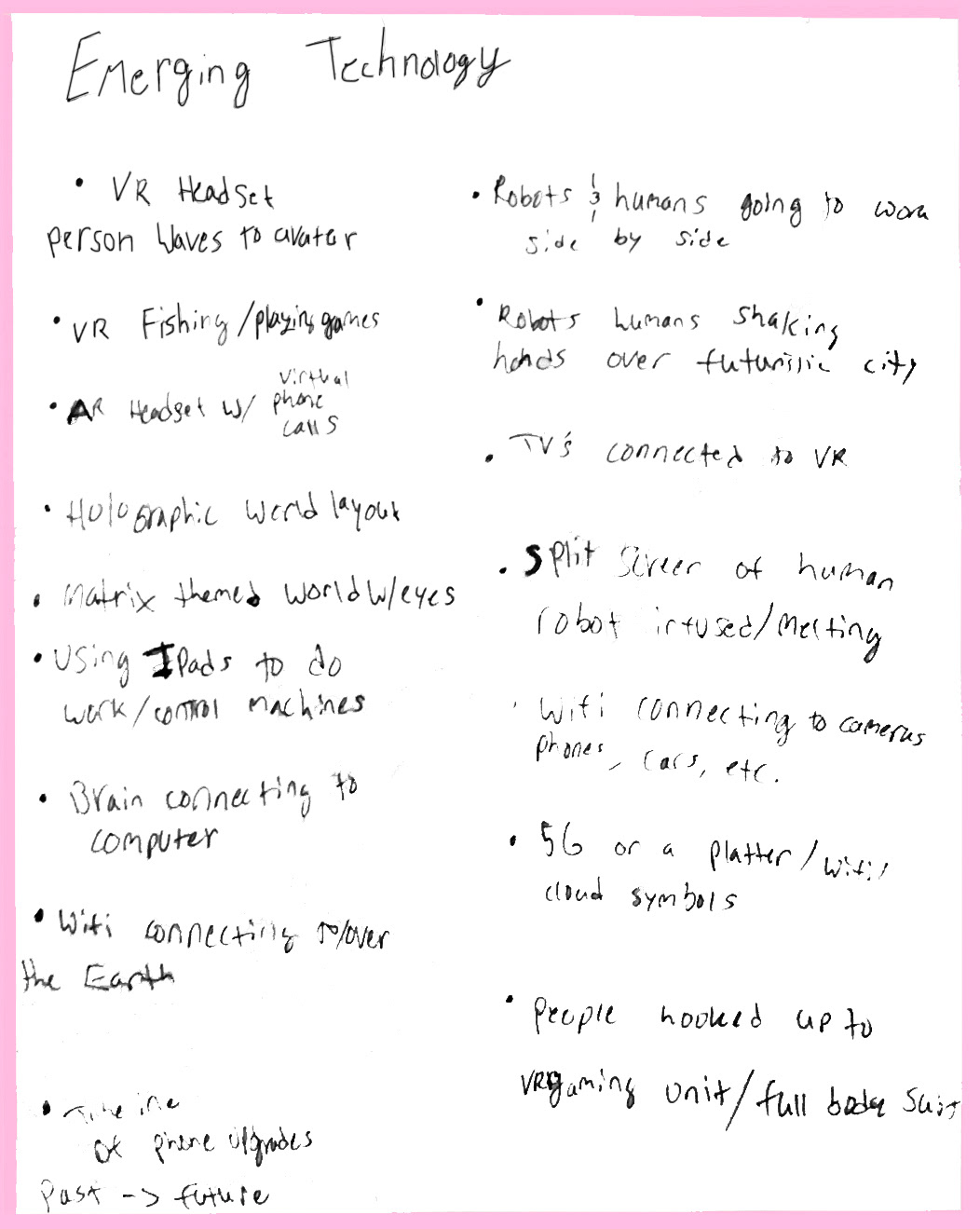
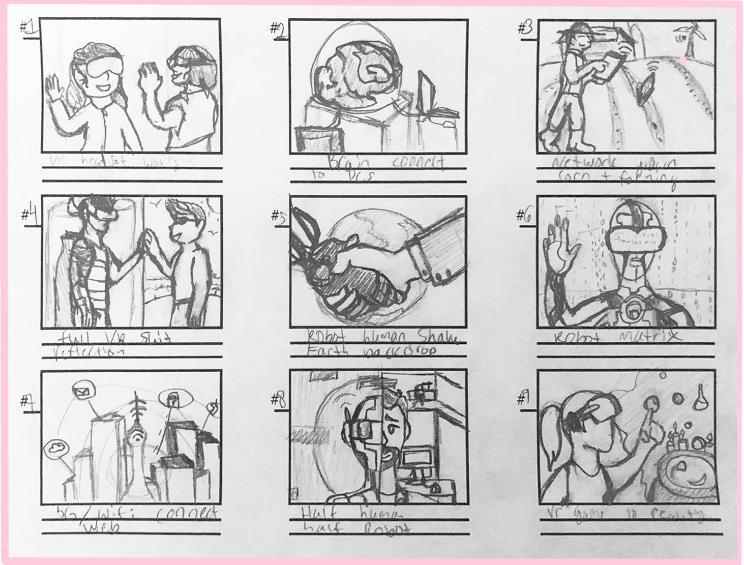
The first step was to take the prompt and start jotting down possible ideas, themes, and concepts to explore. I then took some of the best ideas I had and then went on to translate the ideas by creating thumbnails.
Thumbnails
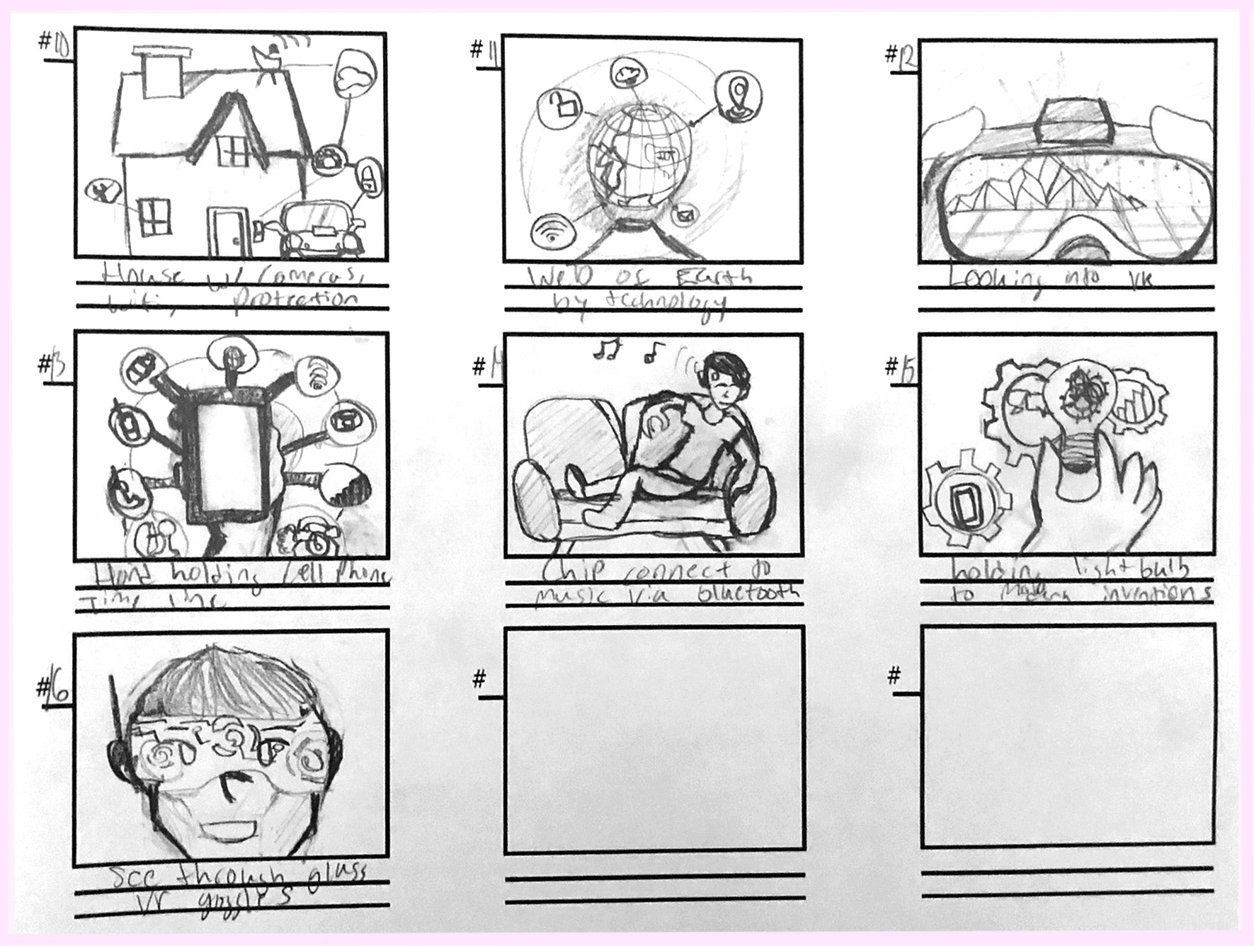
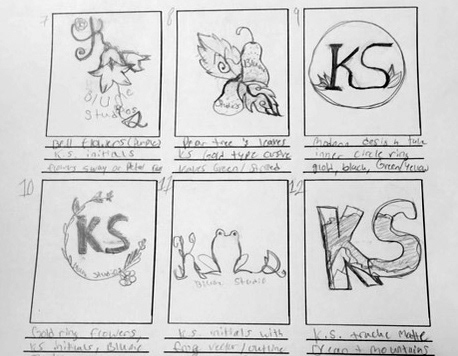
To begin the visual aspect of this project, I started with lots of research of simple infographic and clip art style designs while generating and sketching quick small scale thumbnails and ideas for a robot and humanity theme.
1-9
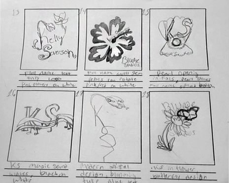
10-16
Here are the thumbnails I generated while researching. I was torn between choosing an inside look at the oculus and virtual reality, but I settled on the idea of humans working together with machinery.
Production

I then created the illustration with the idea of humanity and robots joining hands as a peaceful launch of the projected future relationships humans will have with technology, working as a team.
Revisions

Tech Original Image

Tech Edit Final
I then went back in to refine and edit the design. Though the changes are seemingly slight, I was happy to go back and clean up the design. There were still some areas like the hand, that needed patching, tweaking, and shading which enhanced the clean look it was previously approaching.
Final Product

The finished image came out great and looked a bit more professional with the help of those changes even though they are quite subtle differences like the outlining, fixing of small mistakes, and very small color changes.
Graphic Design
Creative Process Video: Buddhism Infographic
For this infographic project, the overall goal was to design an infographic based on a selected religion with cited research, facts, and connections to other religions. Then, record the creative process through a video with captioning, voice over, and speed paints including a power point presentation.
Mood Board and Visual Research
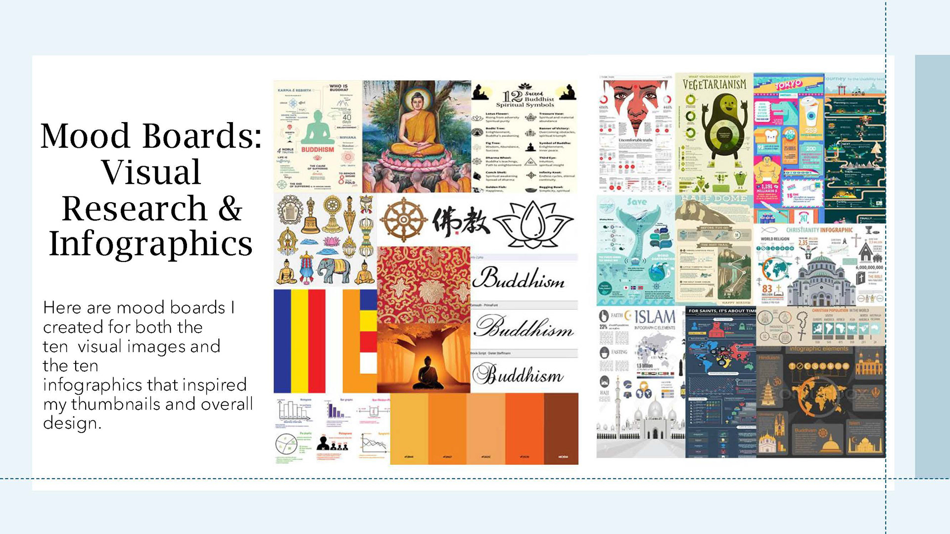
To start, I began with gathering resources and infographics to study how information was displayed through various means (images, pictographs, charts, and so forth). I also began compiling symbols, figures, typography choices, and other information of Buddhism.
Worldview Short Essay
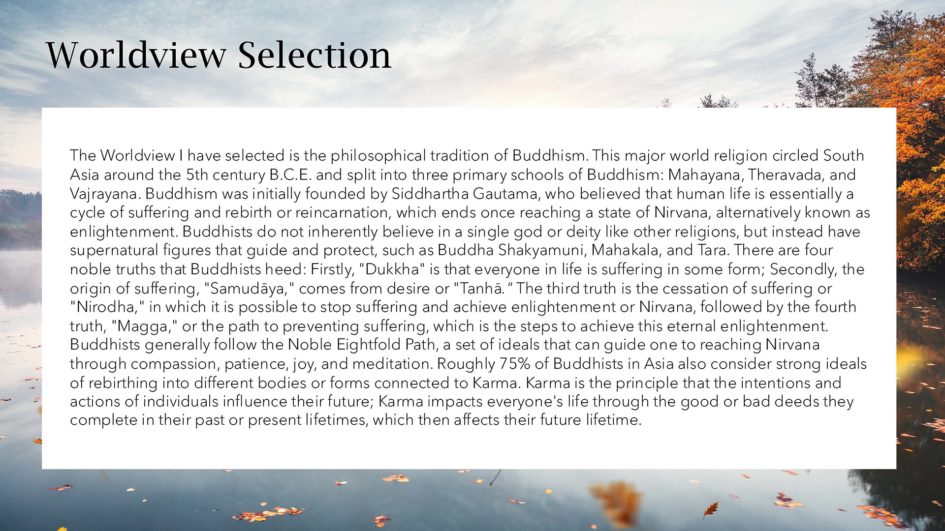
Short Essay
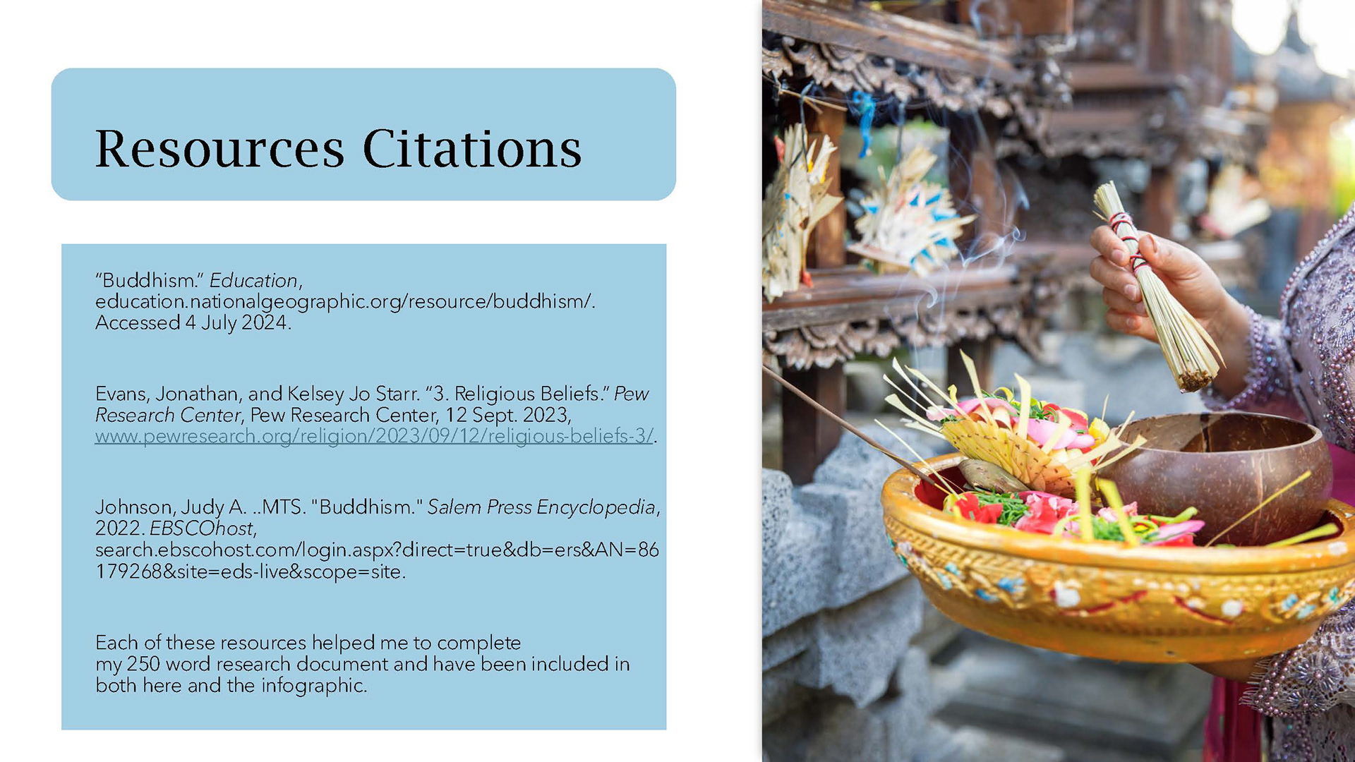
Citations and Resources
Next, I structured all the important information into a paragraph and researched the topic of Buddhism through database sources from Grand Canyon University and other trusted sites, creating a bibliography page to document the research.
Sketches and Thumbnails
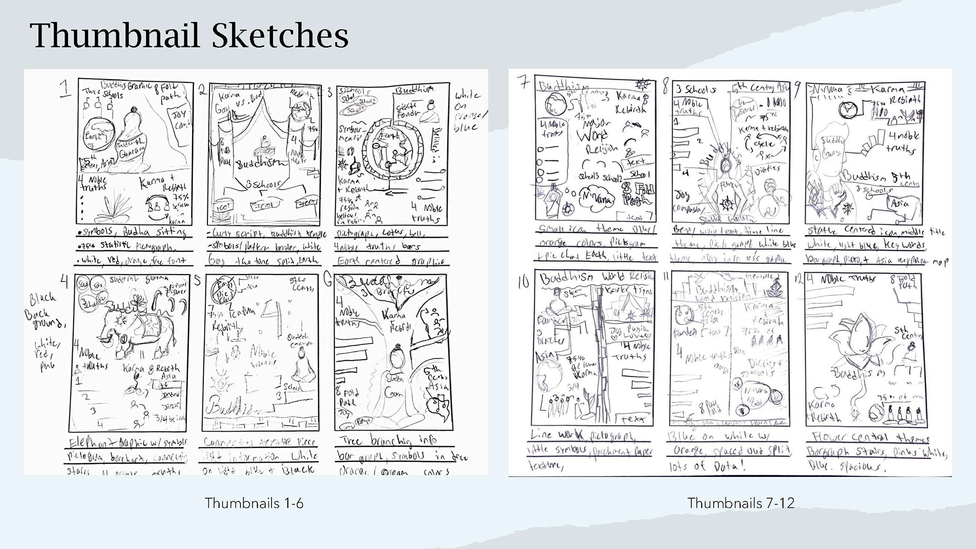
Thumbanils
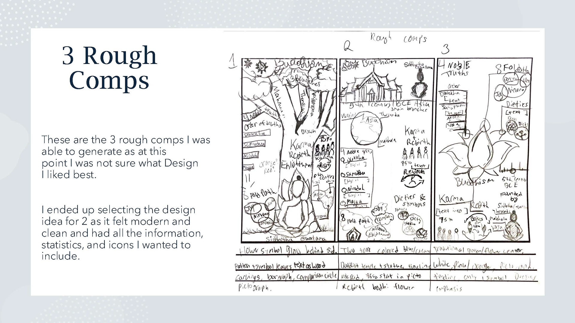
Rough comp
I drafted thumbnails of at least twelve diverse designs and then three rough comps of my best thumbnails. I then chose design two as the most educated and clean design I could create along with the information I chose to include.
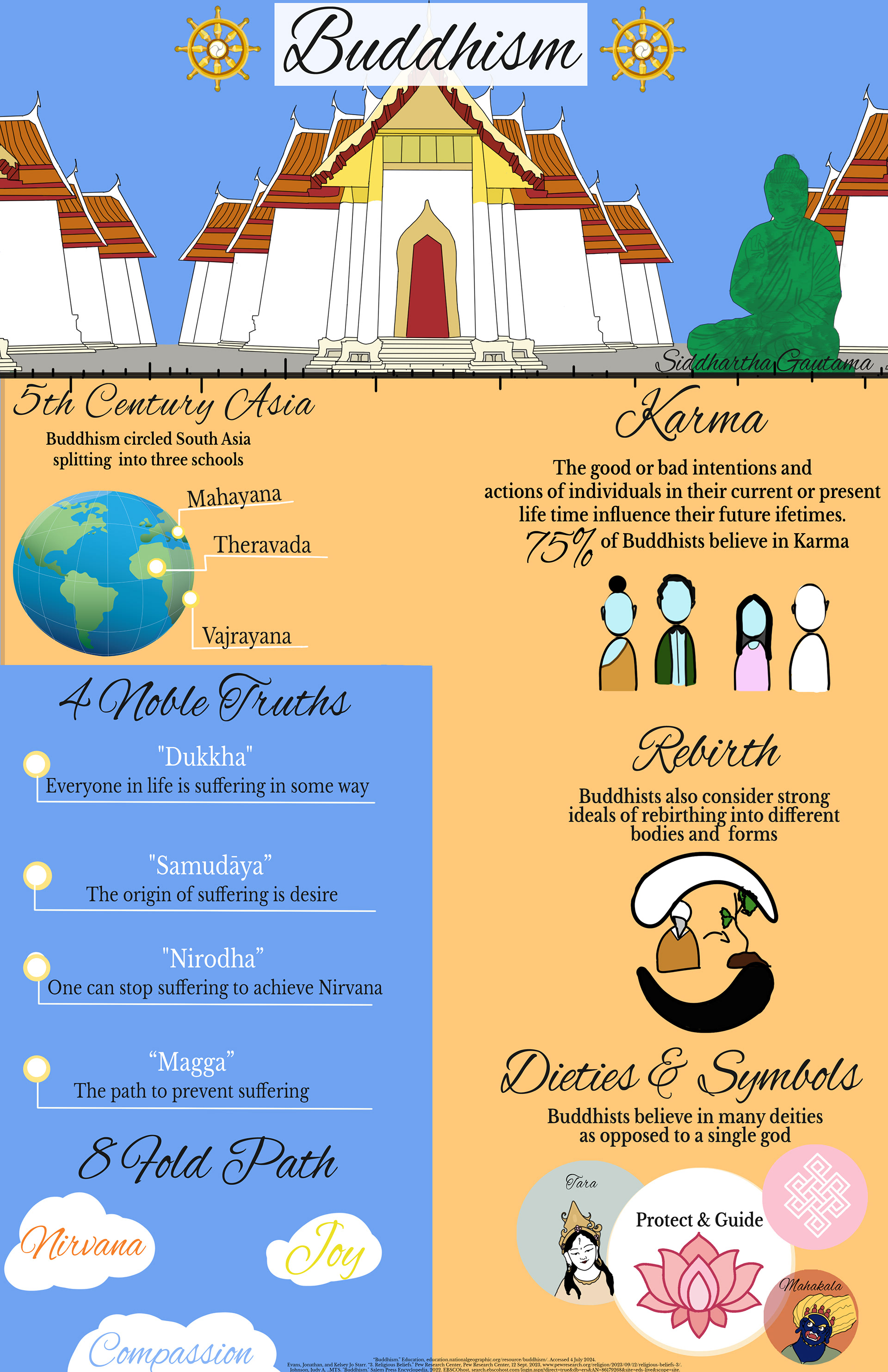
The design came out nicely, hitting all the goals of the design specification and displayed correct, accurate, and trusted information in accordance with the assignment goals. However, there were some parts that felt weak in its design and illustration ability. I felt it lacked a cohesiveness as the specific segments for karma and rebirth felt flat and off putting. Thus, I went back in to re-edit this project.
Creative Process Projects
The final step to complete the full assignment was to create a presentation of any kind and then create a video to display the full process. I included each step complete with a voice over, music score, and digital speed painting.
Revisions


Here you can see the changes almost immediately and how they impact the appearance of the final product. By changing those segments, updating the graphics, and making the text more readable made this a much more concise, clean, and professional infographic.
Final Design
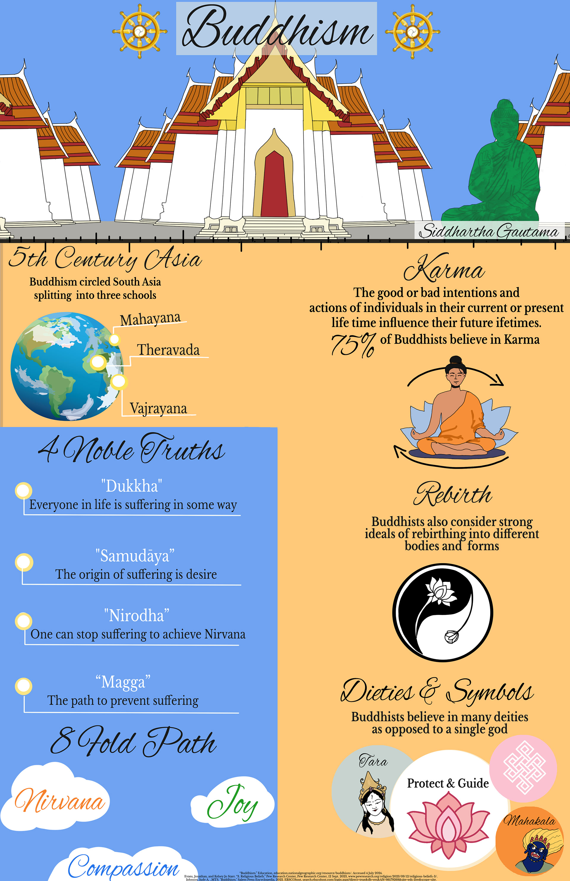
Worldview Infographic, 3300 x 5100 px, Photoshop 2024
With this updated iconography for the segments, the design felt so much more cohesive and showed off more of the ability to illustrate more. These designs with slight changes in text size and placement seemed to be very positive changes to the original, which made this piece feel a lot stronger.
Digital to Print Magazine
Print to Digital magazine on camping basics featuring full length articles, real people, real edited images, and fictitious advertisements.
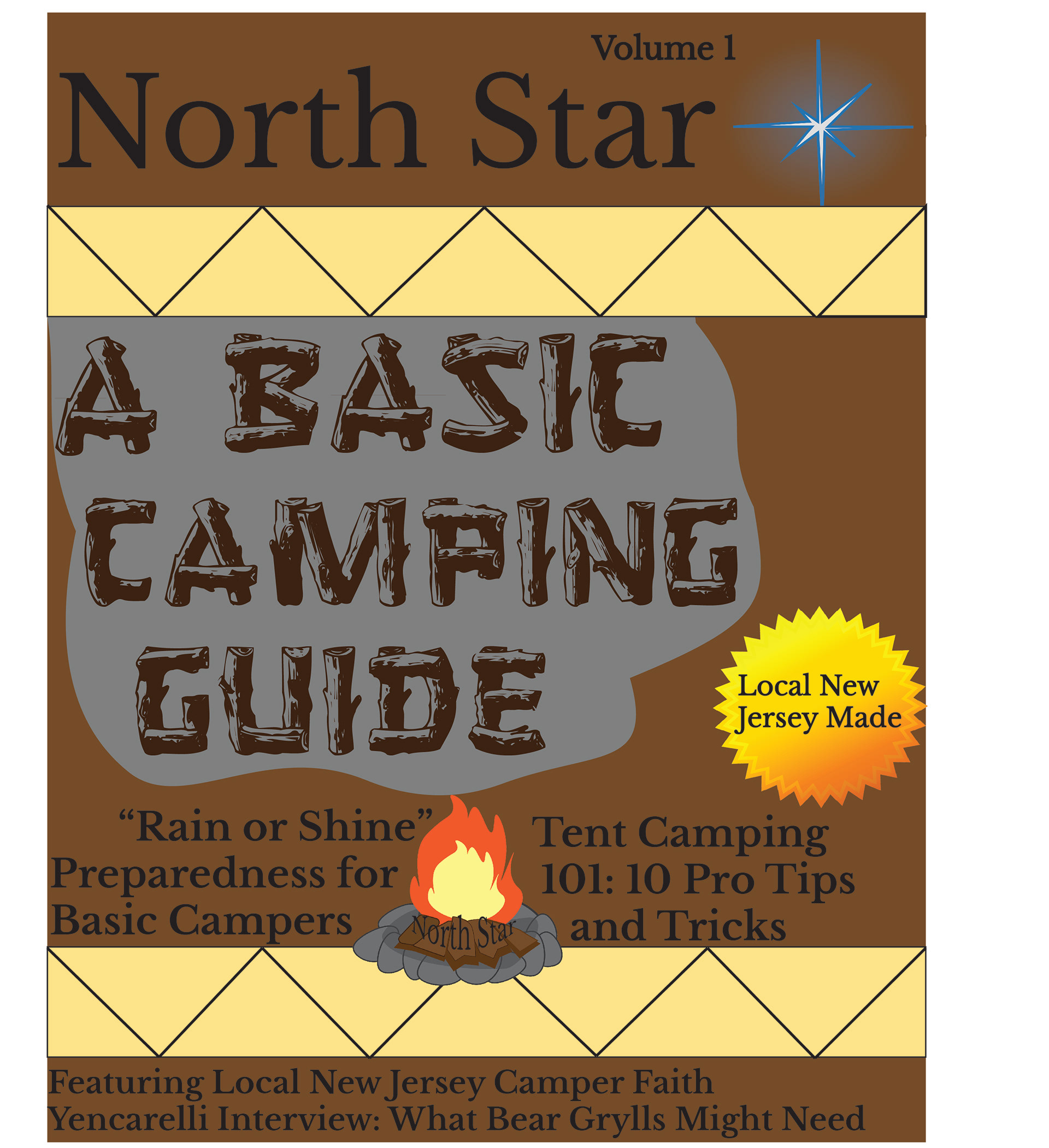
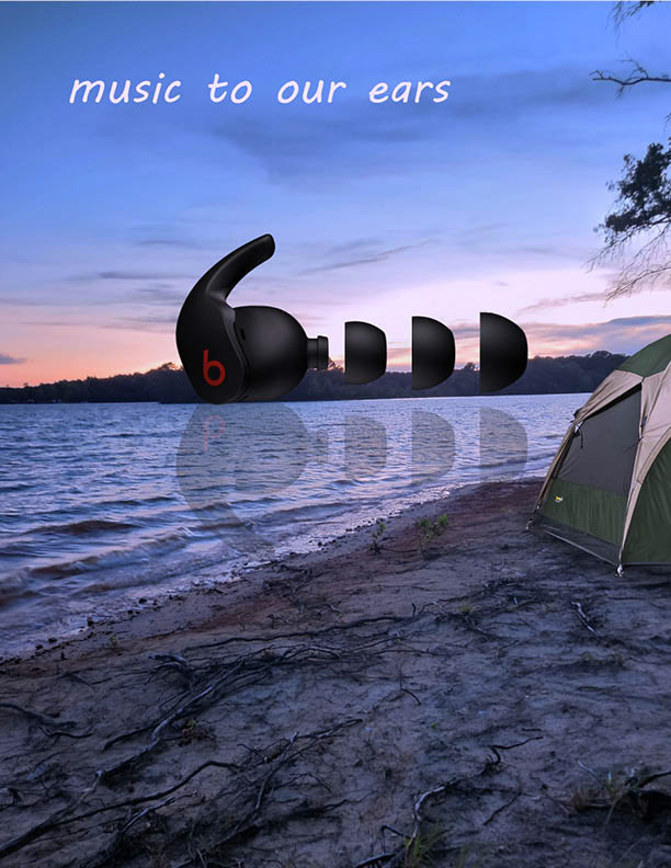
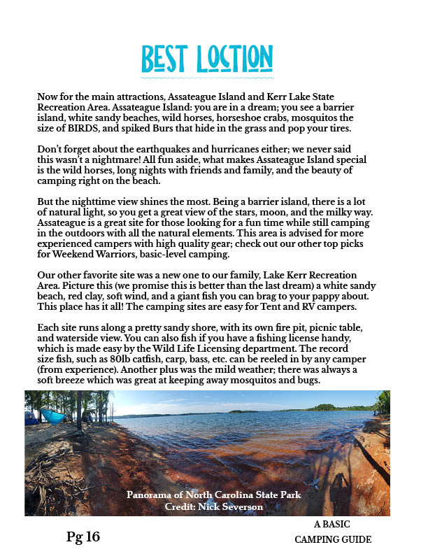
North Star: A Basic Camping Guide
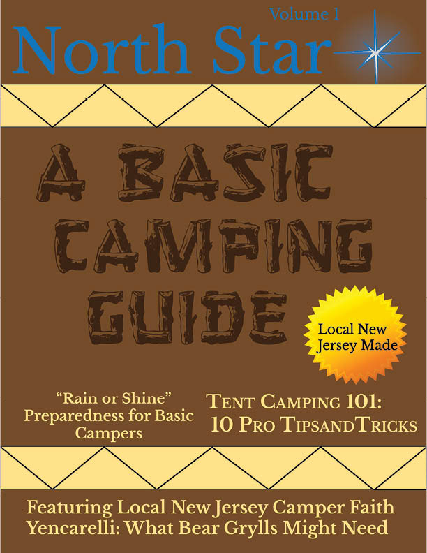
"North Star Magazine" Photoshop and InDesign 2023, 8.5 x i11
I was thrilled when I was tasked with creating a magazine on any topic I desired (so long as it was appropriate of course) designed for the printing process and creating a digital copy. For my topic, I chose to design the magazine as a how to guide with the intention of sharing personal camping stories drafted from myself and my family members. I designed each page to industry standard in accordance to the project specifications and overall goal of developing a professional grade magazine.
Flat Plan Layout
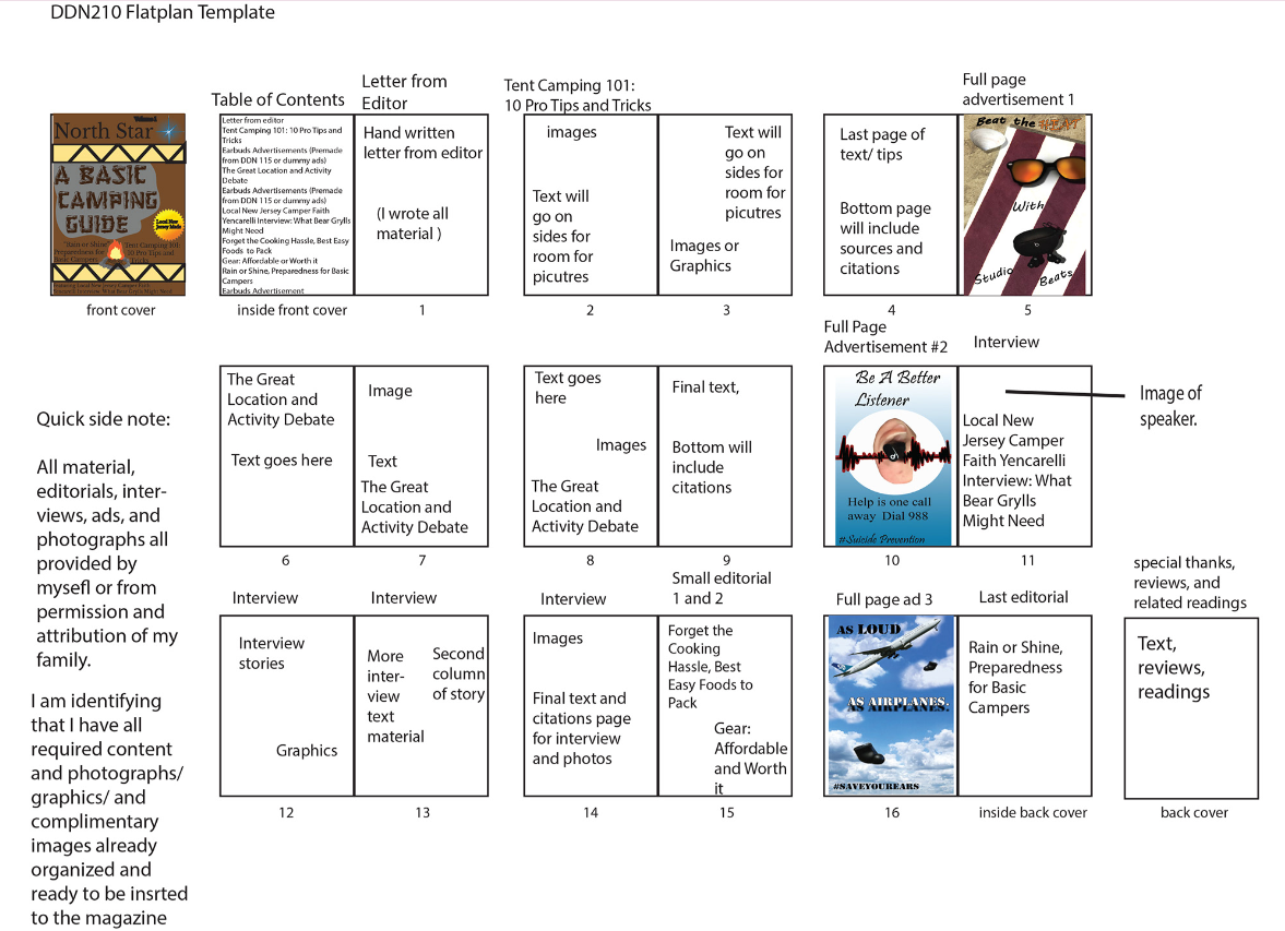
The first thing I needed to do besides starting to gather assets or designing, I was to set an effective flat plan for the magazine and its contents. Luckily, I was able to use advertisements I had previously designed and I had some of the images and content fully planned out. I did end up changing the lay out for the ads and their overall placement to match traditional print magazines I had utilized as references.
Company Branding and Magazine Cover

Camp Fire logo

North star V2
North Star V1

Sticker
After researching other camping magazines, I began branding for the fictitious company North Star, which offers a magazine subscription of various camping guides. I created each logo using Illustrator. The star logo became the masthead since I always used to watch the stars when I camped as a child- I then updated it to have a glow based on peer feedback. I created the fire pit and the sticker decal as additional elements related to the brand.
Original

Final
I started off designing this project which was meant to focus on having a typographical present cover which was a major point I was missing in the beginning of the production. I started to understand the importance of gutters, margins, spacing, hierarchy, and so many other important design principles meant for full printing. I cut the smoke, went with some different colors for the secondary typeface and masthead.
Advertisement and Image Updates
Ad 1
Ad 2
Ad 3
As you can see, these ads were not appropriate enough besides the beach themed ad three to actually be put into the magazine as legit ads. Thus, I went ahead and created ads that were related to camping or the water at the campsite and changed the aspects quite a bit to match a more professional tone.

Ad New 1
Ad New 2
New additions felt so much better and matched the camping theme and colors of the pages they were next to. This was the best switch I could have made an are leaps better than the originals.
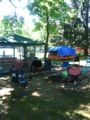
Original

Final
The image above was a cool shot oft eh campsite I had been at but the major issue was that this image was absolutely not of high enough quality since they it was a pretty old picture. Thus, i replaced it with a different photo from a more recent trip which added majorly to the beautiful camping theme.
Full Complete Magazine

Cover
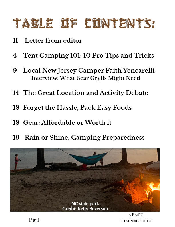
Table of Contents
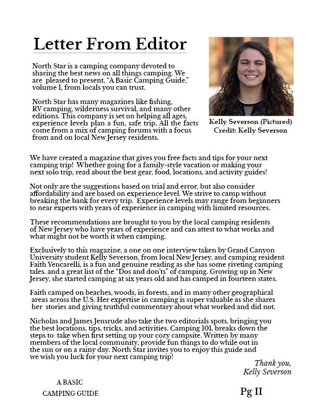
Editor Letter
10 Pro Tips
Tips pg 2
Image 1
Tips pg 3

Ad 1
Q&A 1
Q&A 2
Image 2
Q&A 3
Ad 2
Location Debate
Image 3
Location pg 2

Location pg 3
Small article 1
Small article 2

Ad 3
This is the full listing of each page in the twenty page magazine featuring the cover, advertisements, and various images and icons. Each story was written fully by myself through several interview sessions with my family members, so all the text is actual writing and not filler. Each page was also designed with the intention of becoming both a digital magazine and meant for traditional printing processes.
2D Motion Design
Blume Studios Animated Logo Design
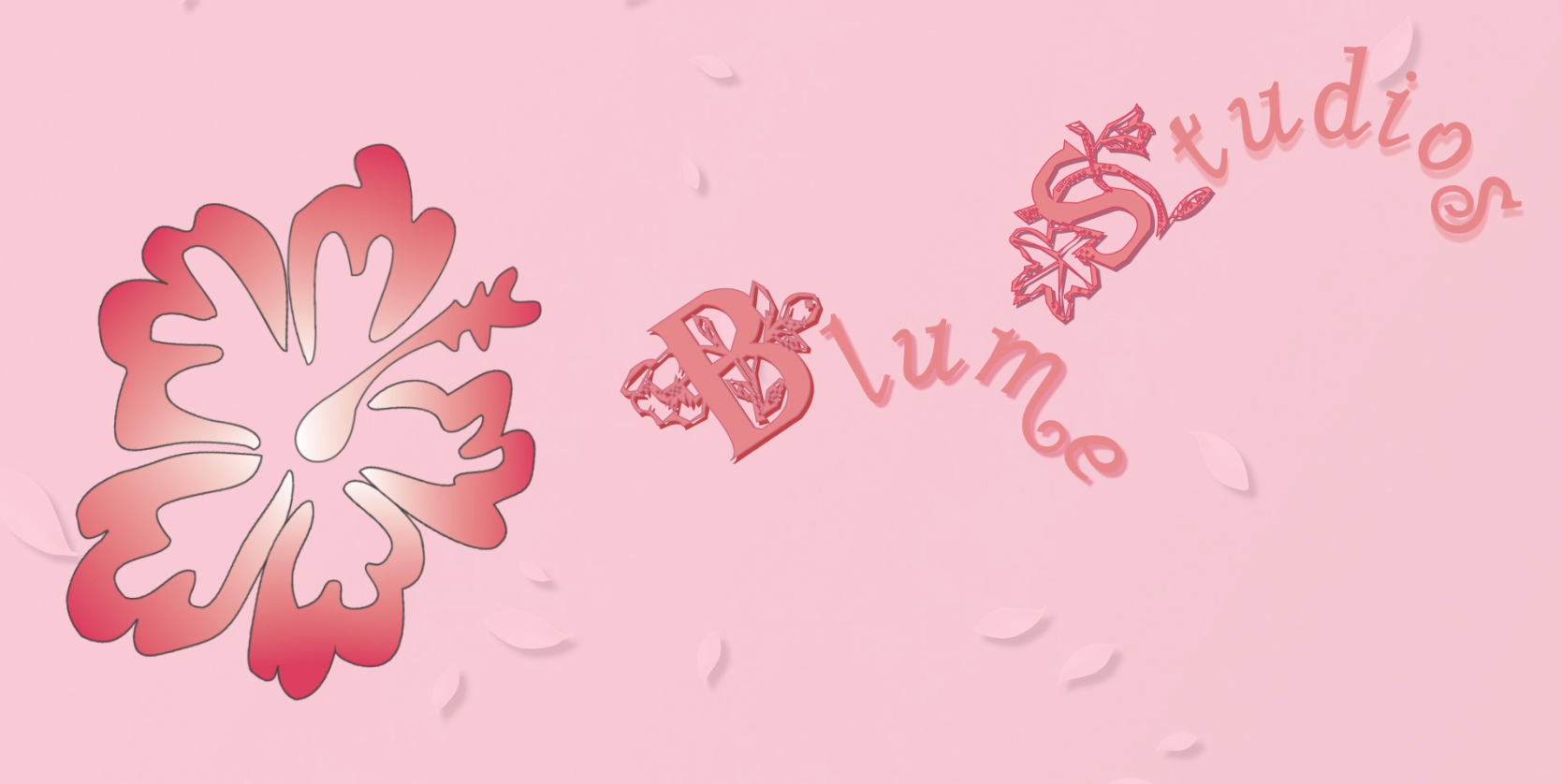
For this project, the goal was to design a unique icon or wordform logo in Illustrator or photoshop while building a brand (I chose to create a fictitious animation studio, Blume Studios) complete with a short 8-10 second motion graphic animation in After Effects or Premiere Pro. This was my first logo design task so I was able to experience just how much typefaces can make or break a design. I had a lot of fun earning how to animate the logo to match a flower in bloom was an exciting challenge!
Pre-visualization
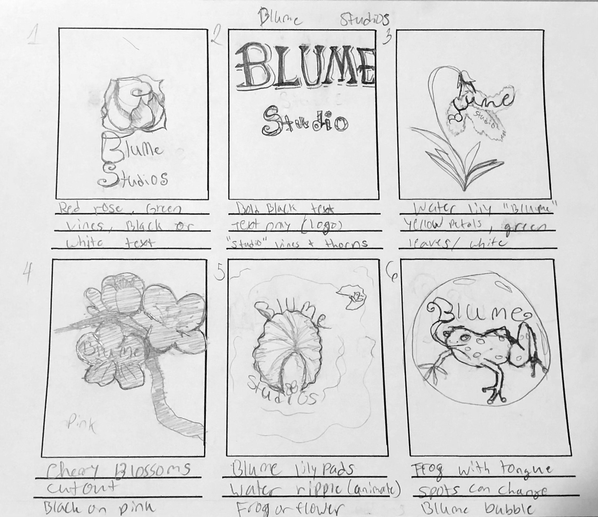
1-6
7-12
13-18
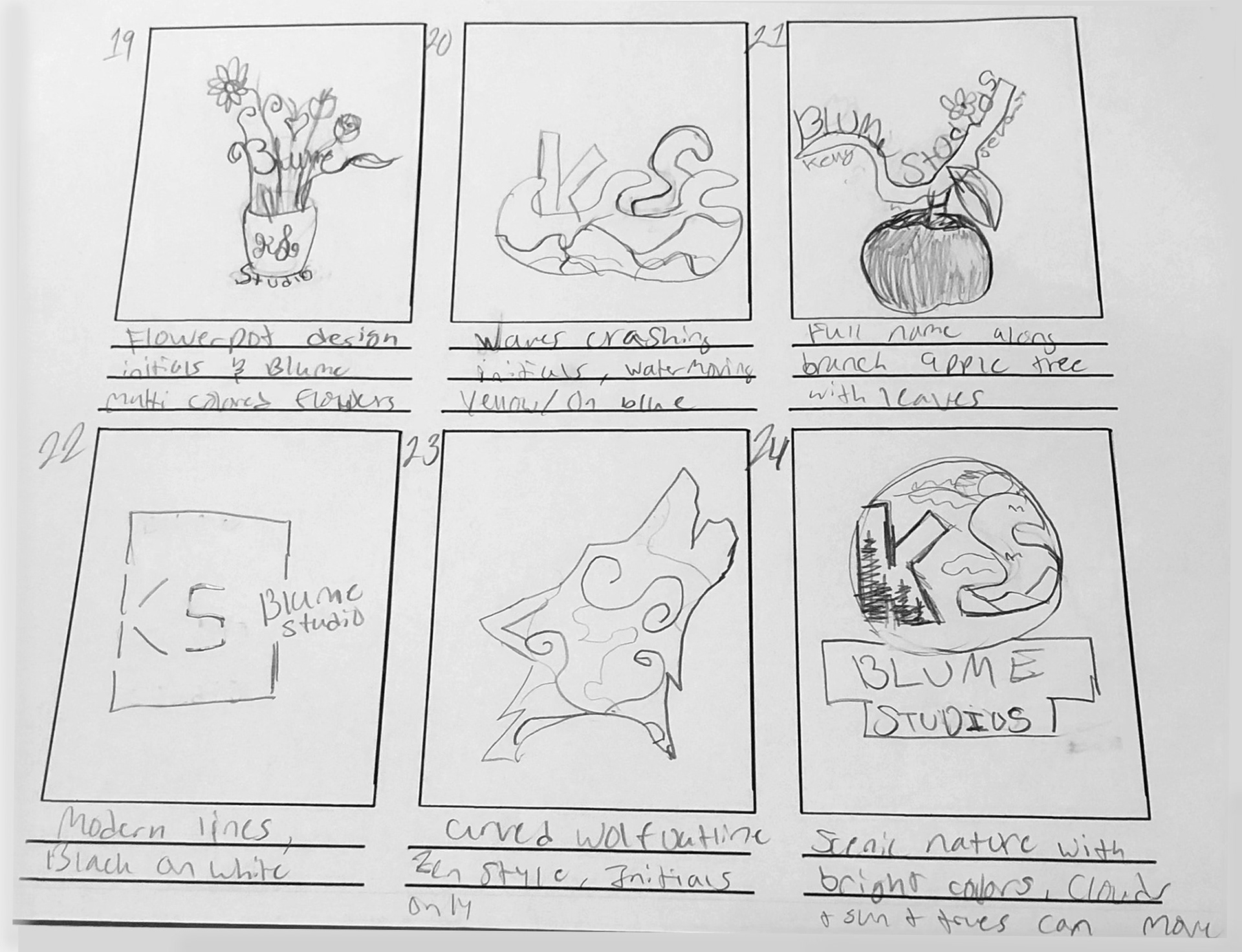
19-24
Here are some of the design samples I created while generating ideas for the brand Blume Studios. I tried to incorporate flower designs that could have animatable qualities like stems and petals. I also focused hard on which design would be most legible and utilizing design principles like balance, unity, and proportion.
Production

2D
Lettering
3D
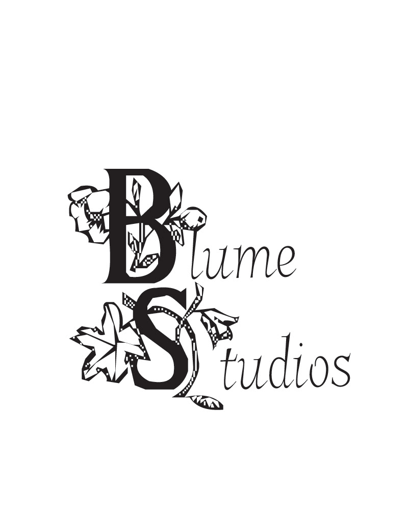
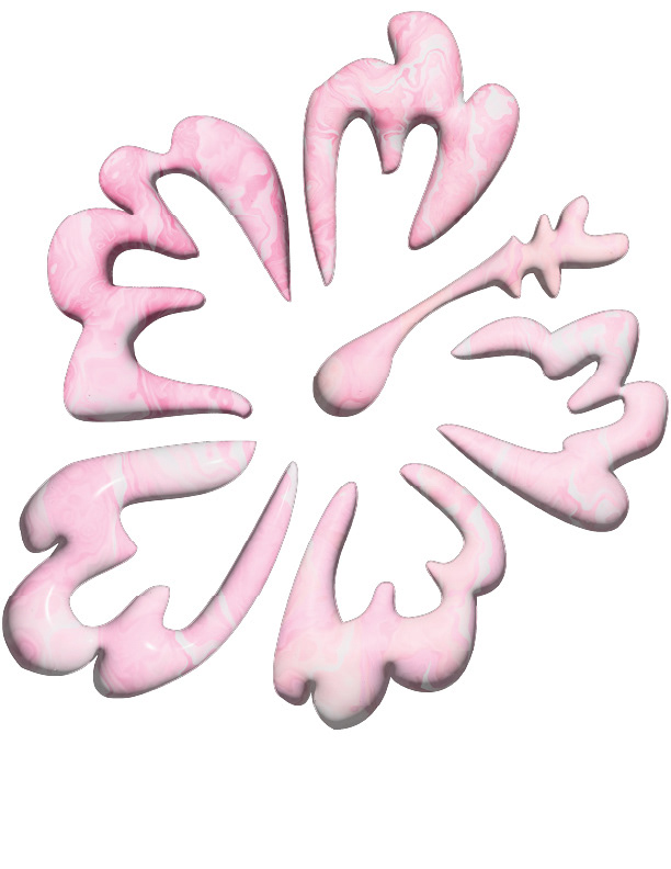
Above are the two logo designs I created in illustrator. I chose to do a hibiscus flower design and felt the petals would be a wise choice for the later animation. I created the flower design in 2D and a 3D model, both organized and ready for export.
Test Renders
To satisfy the requirements, I put together five different animation tests including my 2D and 3D designs them to test what was successful about the overall design and the smoothness of the animated items (hibiscus design, flower typography. I have included the four below that were most distinct and displays the true trial and error process. At this stage, I began narrowing down to one final version to render.
Test 1
Test 2
Test 3
Test 4
I ended up choosing test 3 as my primary logo design and animation. I felt it captured the flower blooming effect and overall tone of the brand. However, I did end up tweaking the overall design and the motion paths for the typography.
Final Product
Blume Studios Logo After Effects 2024, 1920 x 1080
After choosing the most effective video based on peer and personal review, I decided to do some slight color palette changes as they fit better with the scene and flower petal background. I also added on a wave filter animation, tweaked the rotation animation of the hibiscus petals, and smoothed out the animated typographical elements.
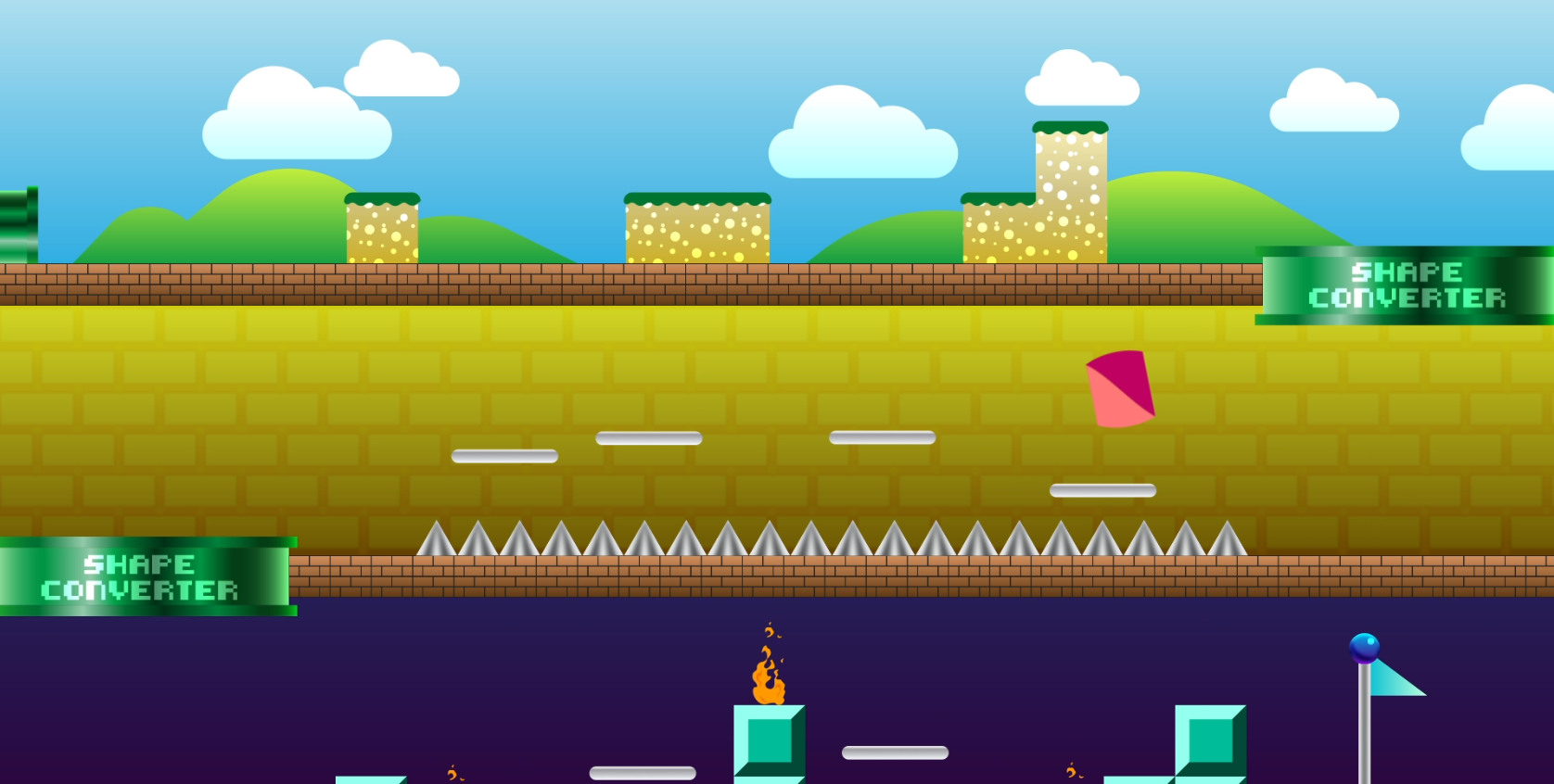
Level Up
For this project, the goal was to take the board and shapes (circle, triangle, and rectangle) and animate them into the scene using a variety of techniques, effects, and expressions. The goal was to make each shape have unique personality while also staying true to the 12 principles of animation, with specific focus on the squash and stretch idea.
Principle Study
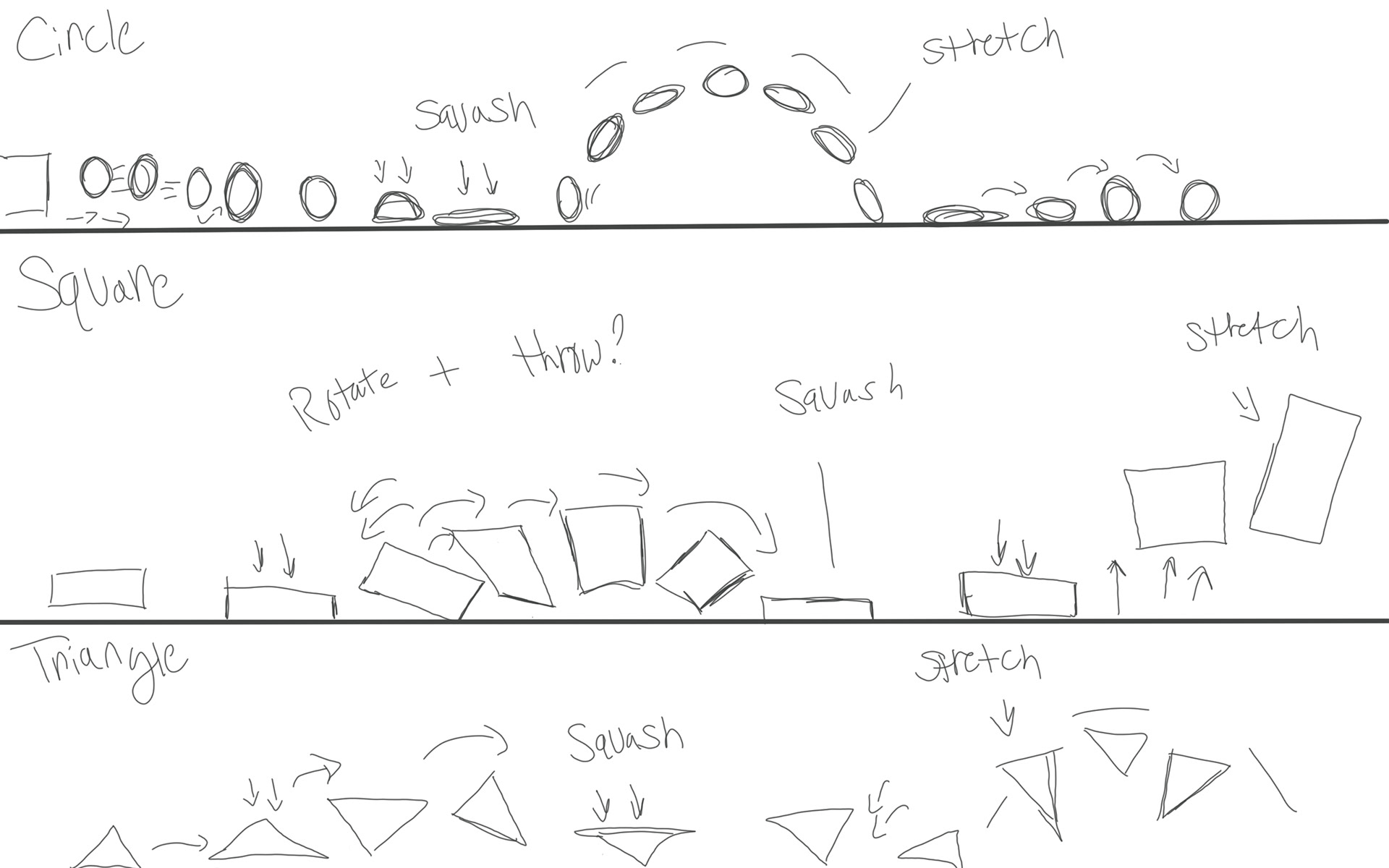
After sketching out some of the shape movements and understanding of how the principles would interact differently depending on the shape, I began animating with the circle first.
Render 1
Draft 1
While the first render came out okay for the circle, the animation still felt extremely rigid and did not incorporate enough of the principles. I got stuck after a while trying with adding new effects like slant and scale expressions, I decided to work on the square and triangle movements. I also built in the sound design with the music first, adding in the jump effects toward the end of the process.
Render 2
Draft 2
For this iteration, I focused mainly on the null objects, how they parent and control the shapes, and tried my best to imagine how a triangle or box would walk and jump. I also used distortion effects and slant to help exaggerate that squash and stretch along with expressions for scale. While this version was much better than its previous, it still needed a bit of work to be at a professional level and worthy piece to show off. I had a more finalized version of the sounds as well including jump effects that now timed well with the movements.
Final Render
Level Up, After Effects 2025, 1920x 1080
After going back into the scene, I began tweaking key frames to try to make the shape movements flow more. I then had the idea to use a liquify and distortion effect to help give personality, and help emphasize when the shapes would jump. The effect also helped exaggerate the landing and squash and the movement of the shapes as it jumped/fell back down to the platforms. I also continued to tweak jumping movements, null animations, and overall tweaking the scene to be better, more expressive, and more fluid as opposed to the rigidness it had before.
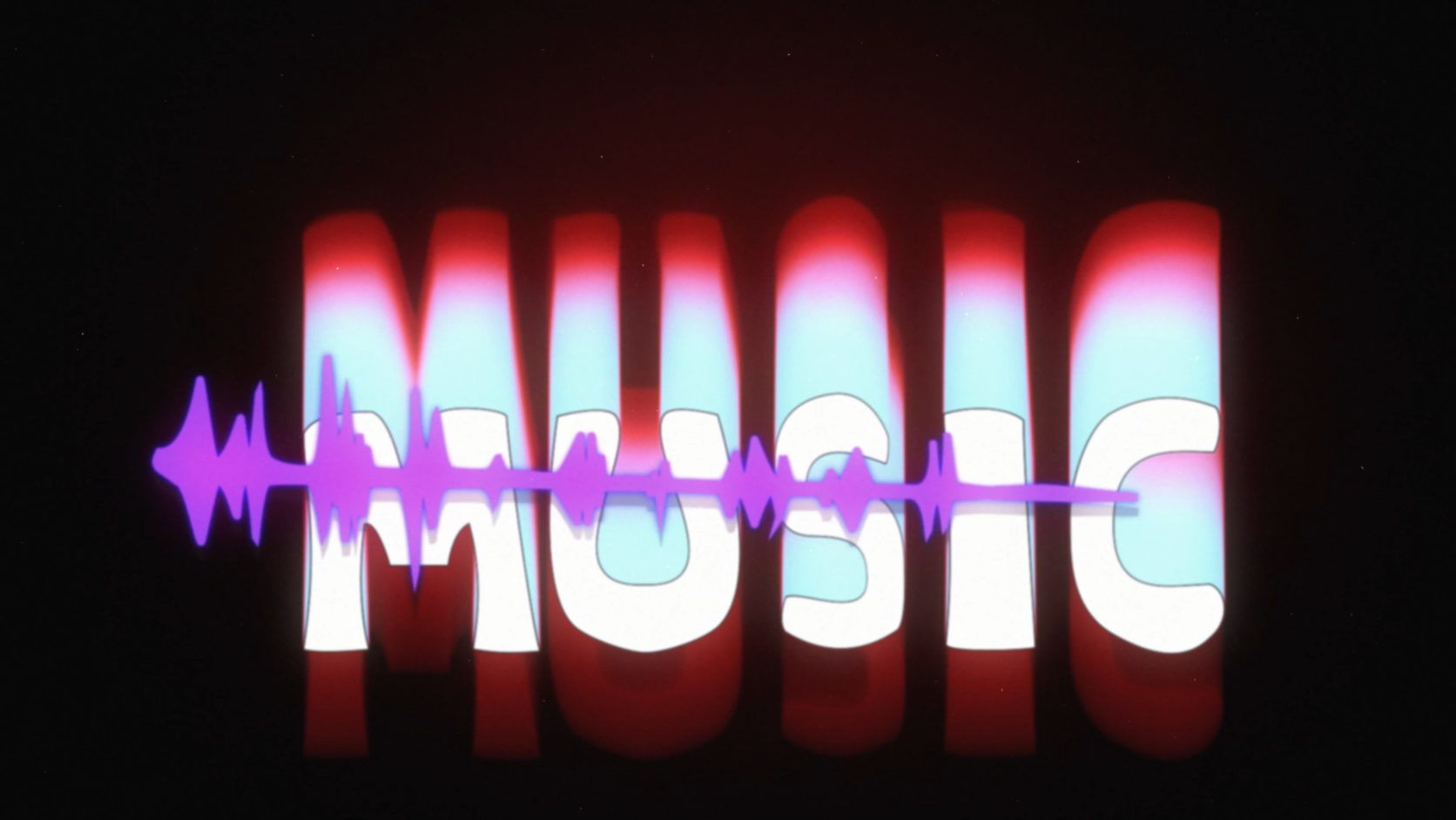
Saul Bass Tribute

The idea behind this project was to select a designer that had a major influence in the field of motion design and create a video title sequence of any kind utilizing royalty free images, videos, and sound design in After Effects. The video had to include transitions or techniques inspired by the selected designer and be around roughly thirty seconds long.
Pre-visualization
To begin, I selected and researched one of my all time favorites, Saul Bass, specifically looking at title sequences “Casino” and “Psycho” for inspiration. I began writing out basic descriptions of what the fictitious sequence is about, and began looking for colors, typefaces, sound design, and other items.
Description/Concept
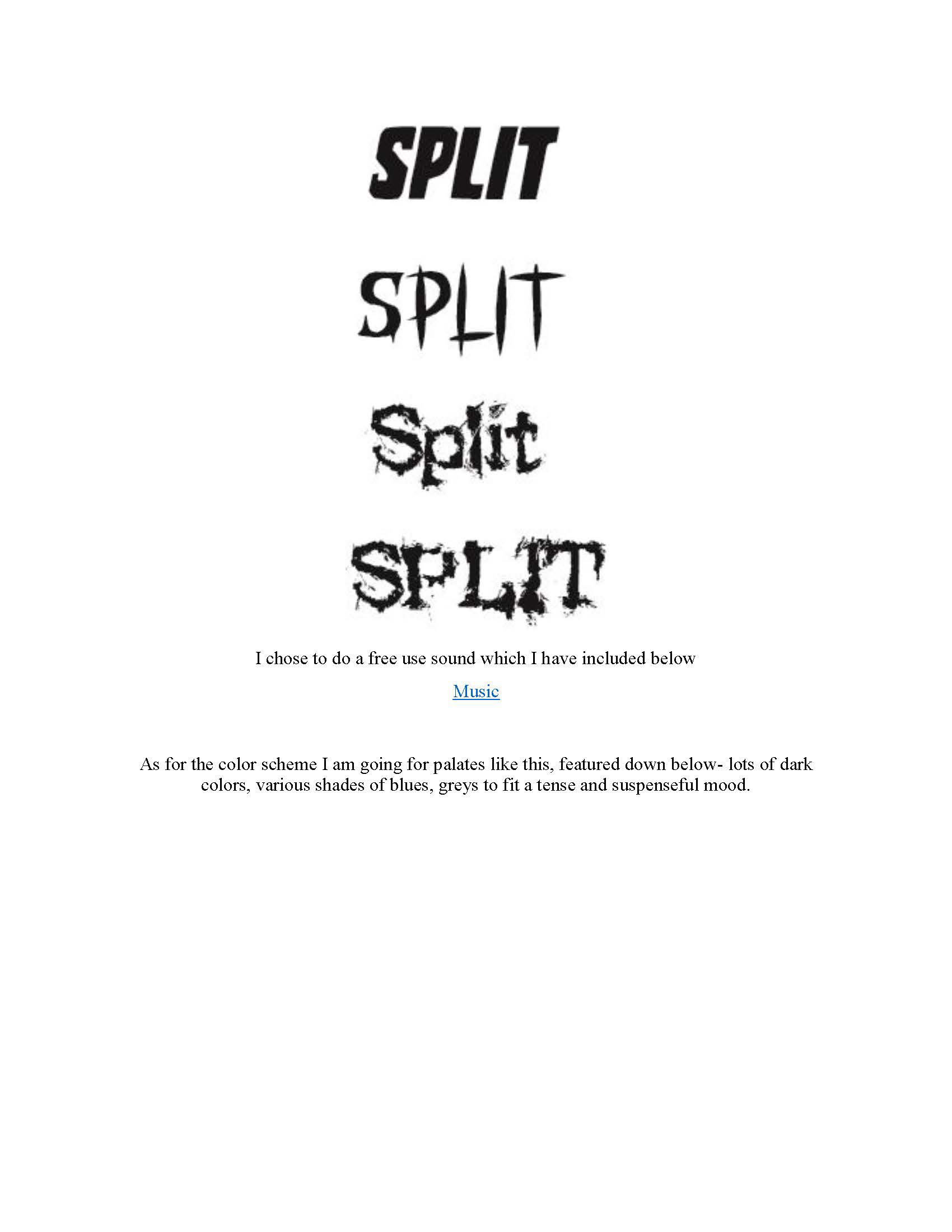
Typefaces
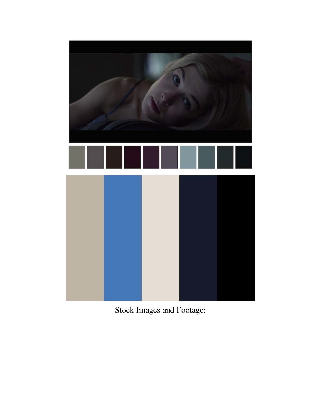
Color Themes
Production
The next steps were to begin collecting royalty free images and utilize them for motion graphics and putting them all together with the video clips to make a cohesive sequence. I also created a storyboard and a proof of concept.
Rough Comps
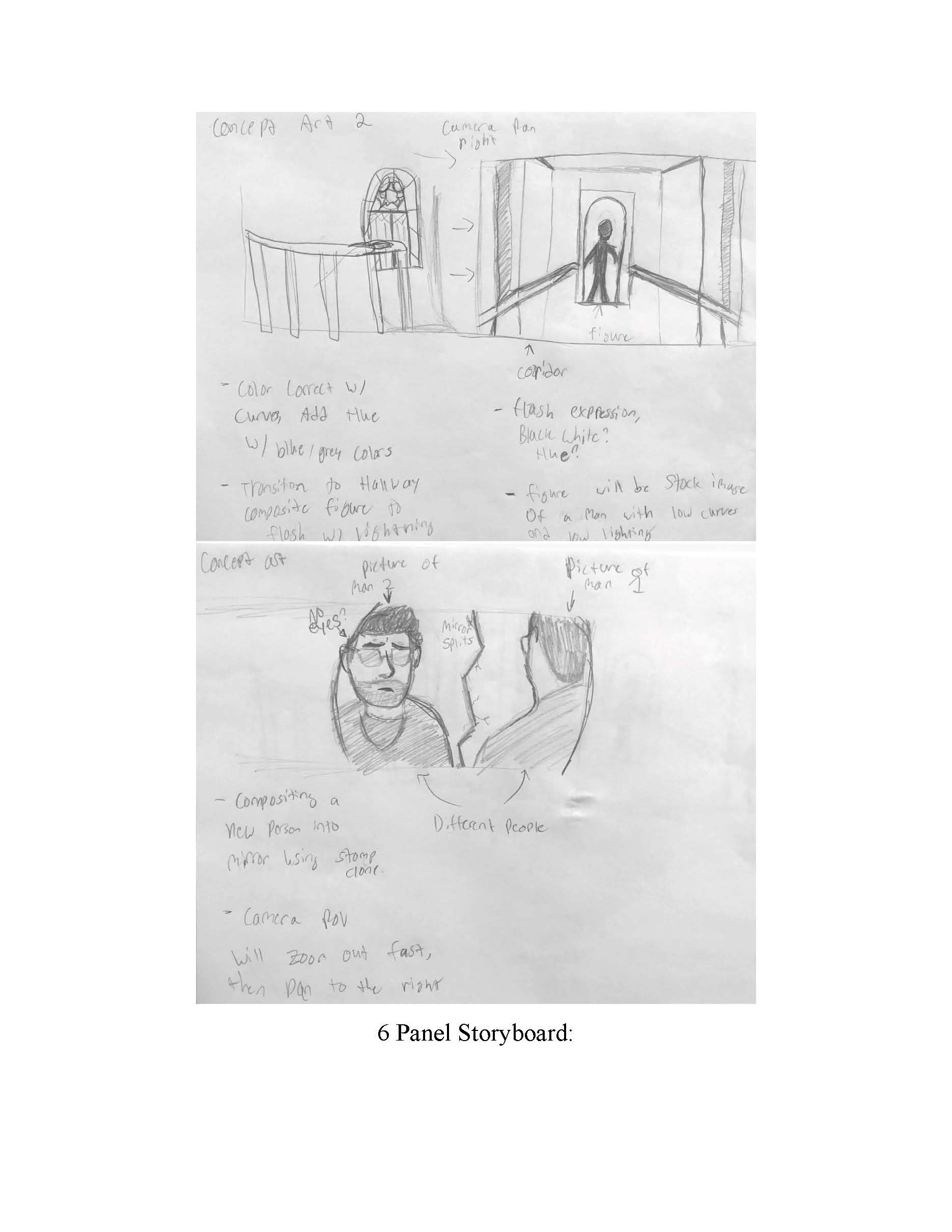
Comps
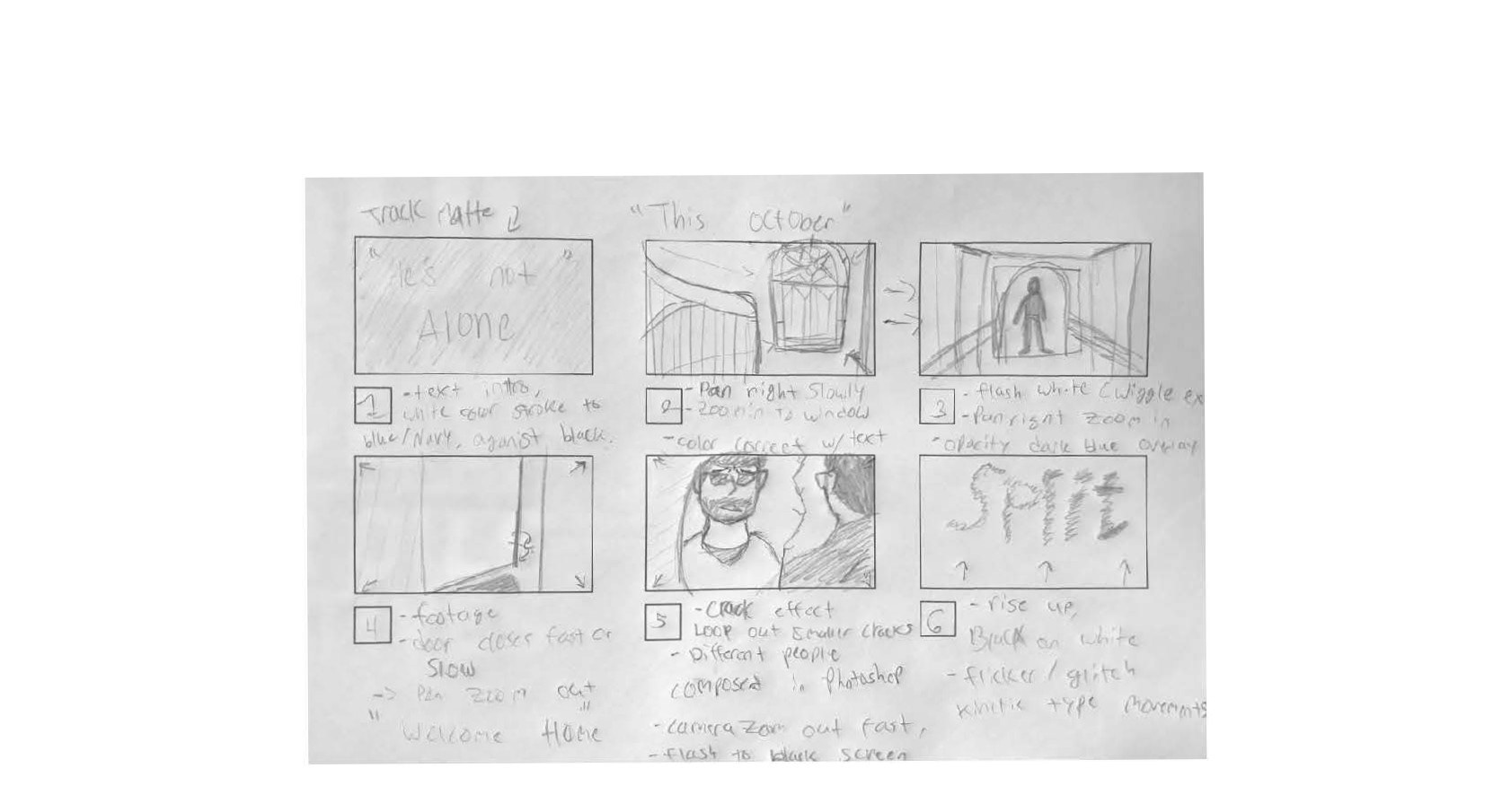
Story boards
After sketching out a solid idea with a storyboard and rough comps of what I needed to create for the video, I started searching for free images on sites like Pixa bay and Pexels that were royalty free. I took them into Photoshop to edit them and make them look like the scenes I drew out. Since the title sequence is more of a horror or thriller type genre, I tried to edit the images to fit this atmosphere.
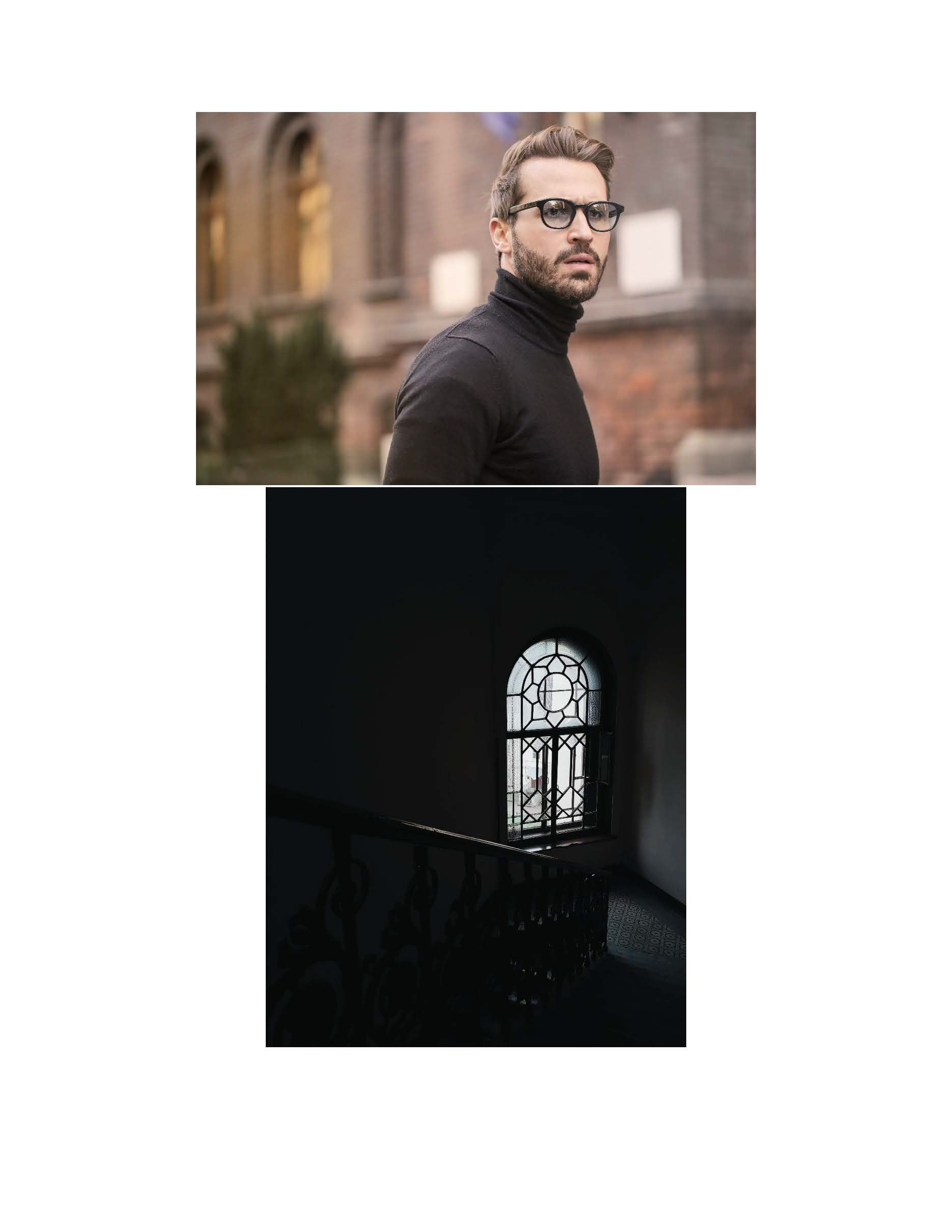
Royalty free images
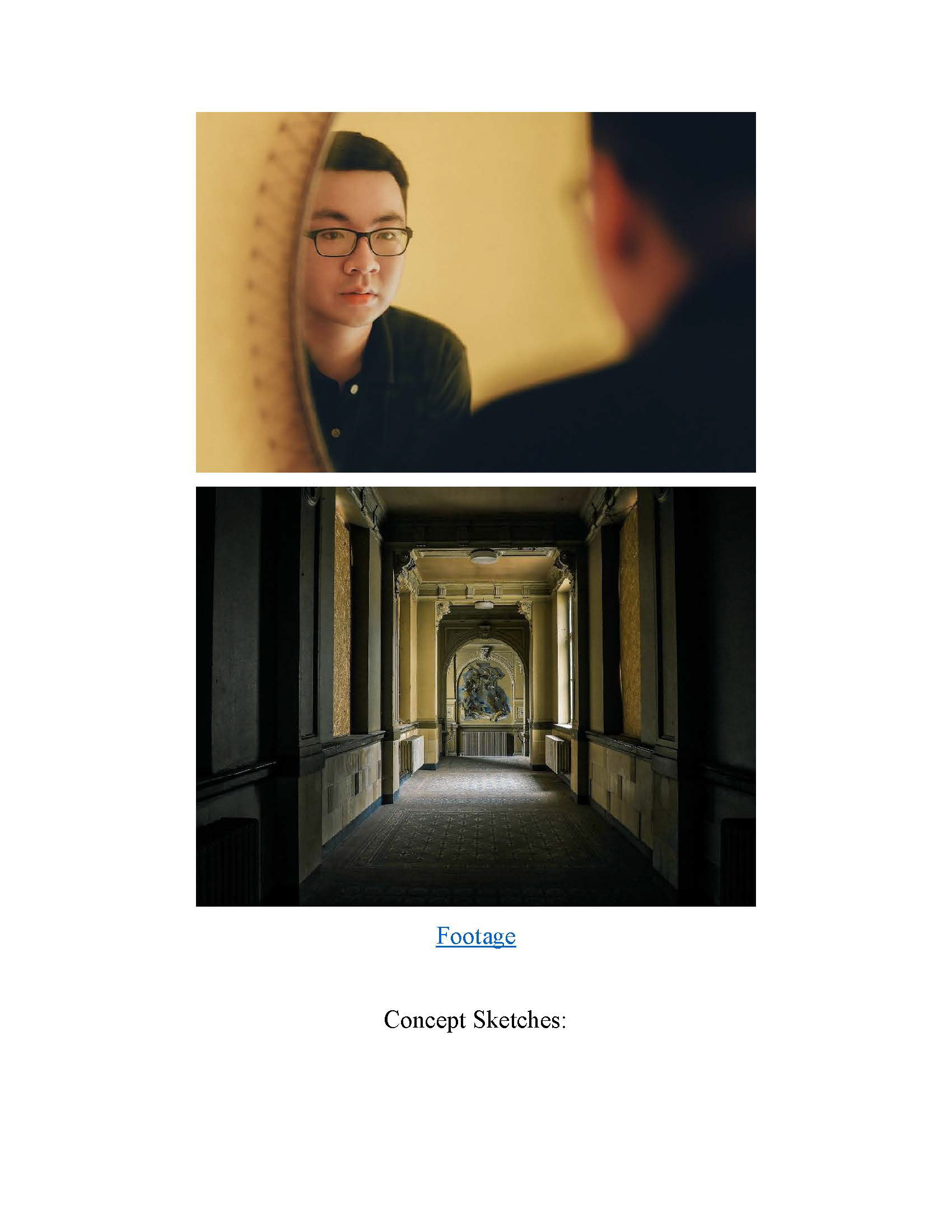
Royalty free images
Graphic Assets
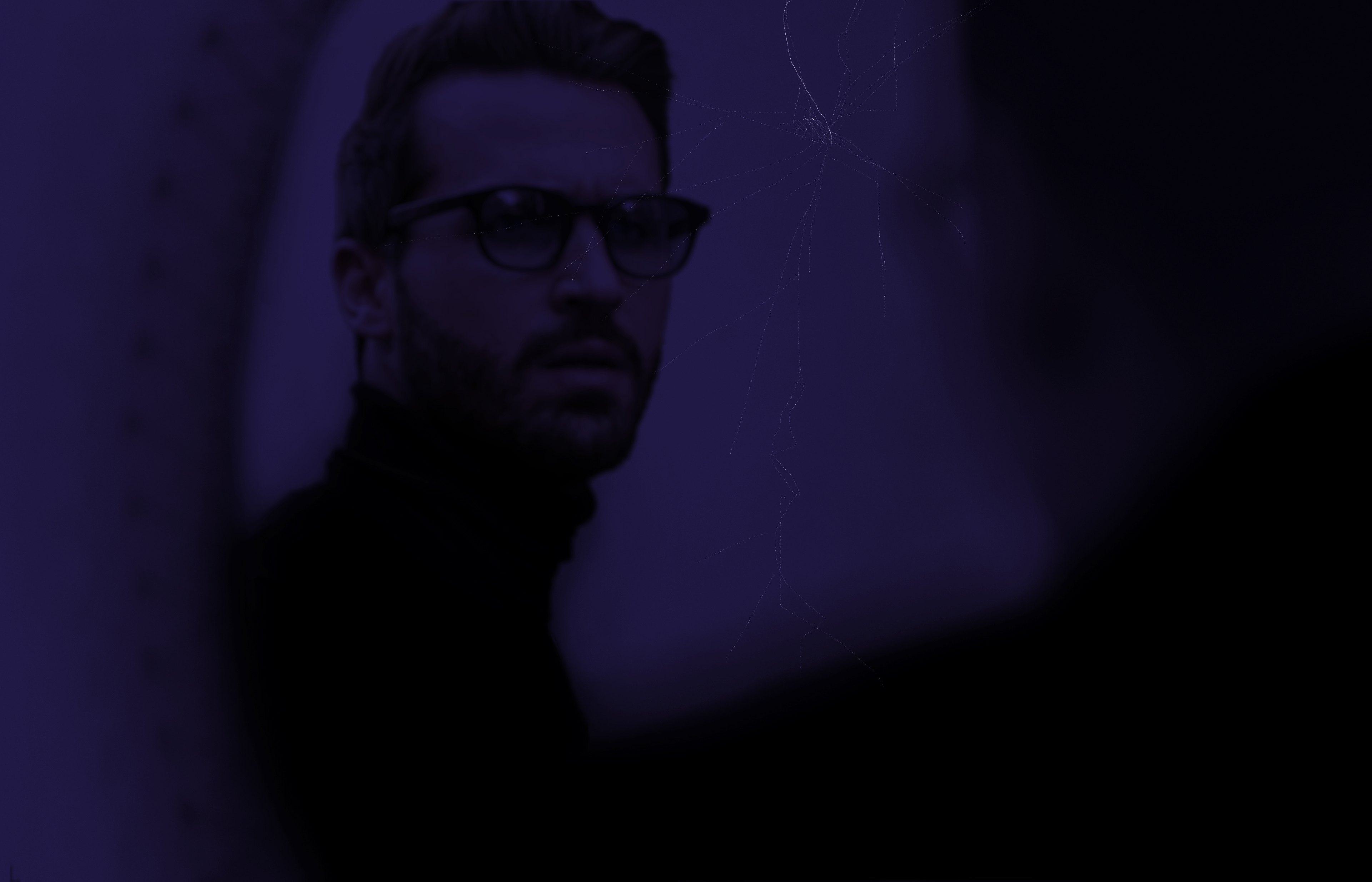
Altered image 1
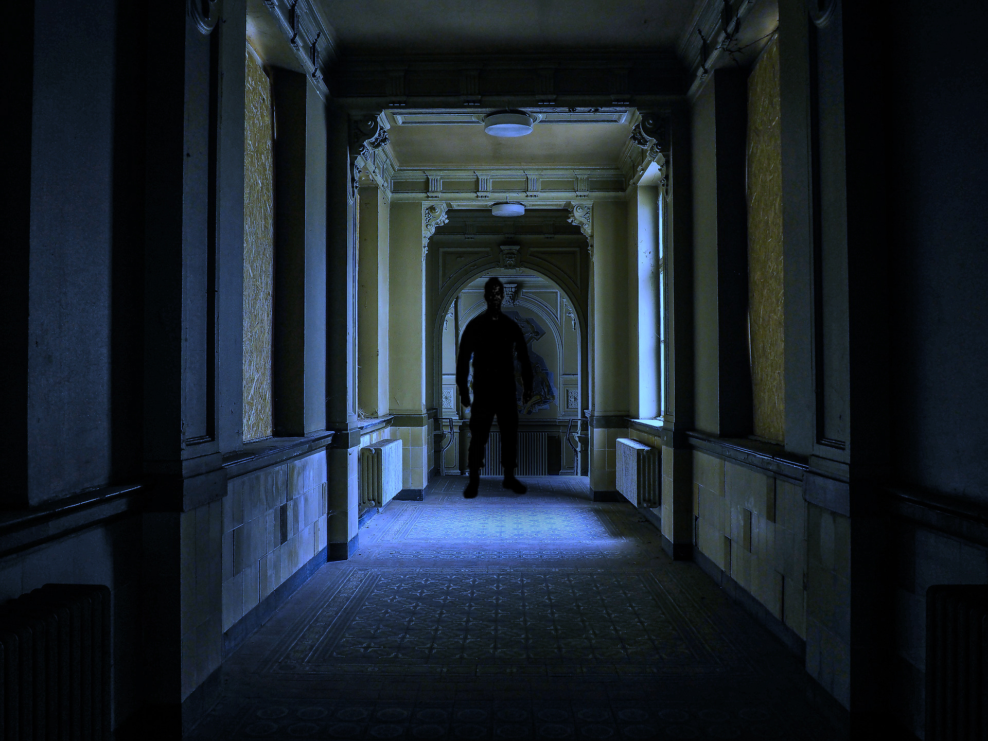
Altered image 2
Altered image 3
Test Render
One of the biggest things Saul bass is known for is amazing title sequence openings with either kinetic typography or transitions that utilize bars, moving shapes, and so forth. Below is the first demo of the title sequence created in After Effects.
Test render sequence
Final Product
After making some progress with the opening title of the film name, I began importing the rest of the clips, comps, and layers for further animation. I came back with a final product that was created using special effects like shatter, expressions, shape layer transitions, and others and rendered out through Premiere Pro.
"Split" After Effects, Premiere Pro, 2024, 1280 x 720
After putting together all of the elements, I think this project was successful in creating a thriller and horror like opening sequence, reminiscent of Saul Bass's unique motion design style. I think between the kinetic type and the overall atmosphere of the video helps make this a strong title sequence to present.