R. K. Schmukkor's Co. Logo Design and Animation
As a concept, this project's goal was to take a well-known company's logo and create an off brand/alternative designed and animated logo (avoiding copyright of course!) and create a motion design video incorporating the new logo. The idea was to essentially create a new or similar logo design and following animation but change letters, words, or other definable trade marks to keep out of any legal issues or copyright troubles.
Research
Creative brief
MC D
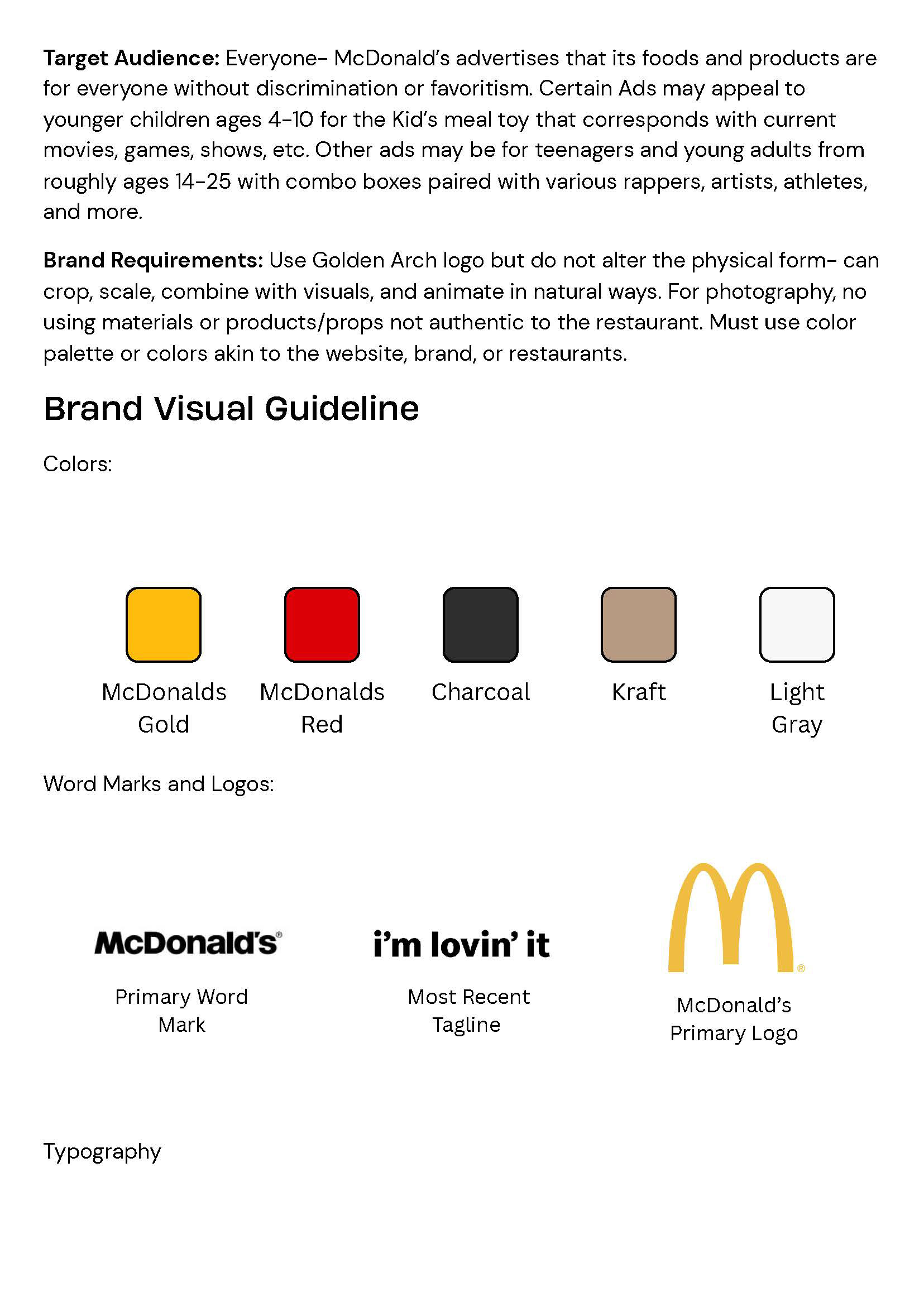
MC D
Pepsi
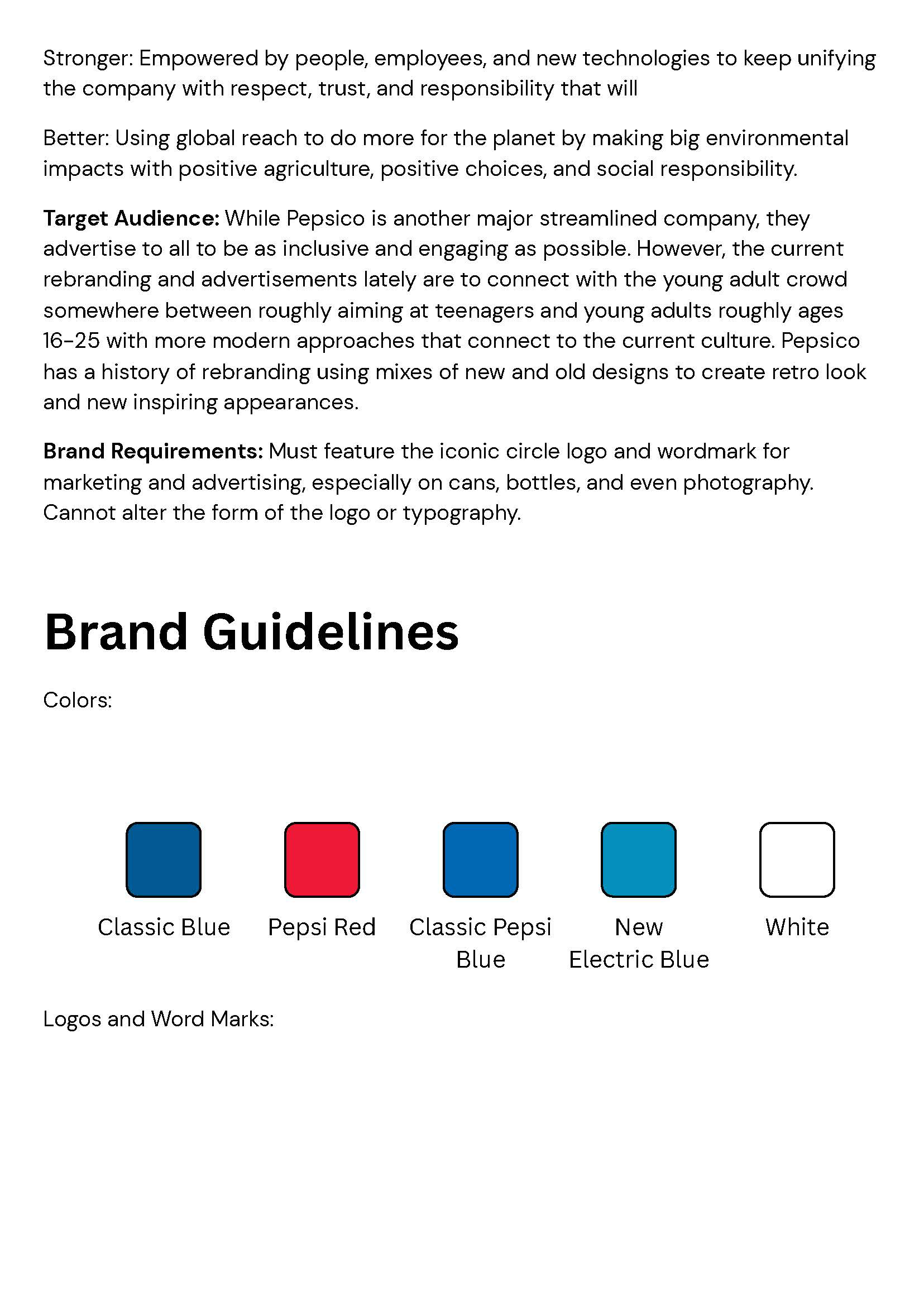
Pepsi
Pepsi
J.M
J.M
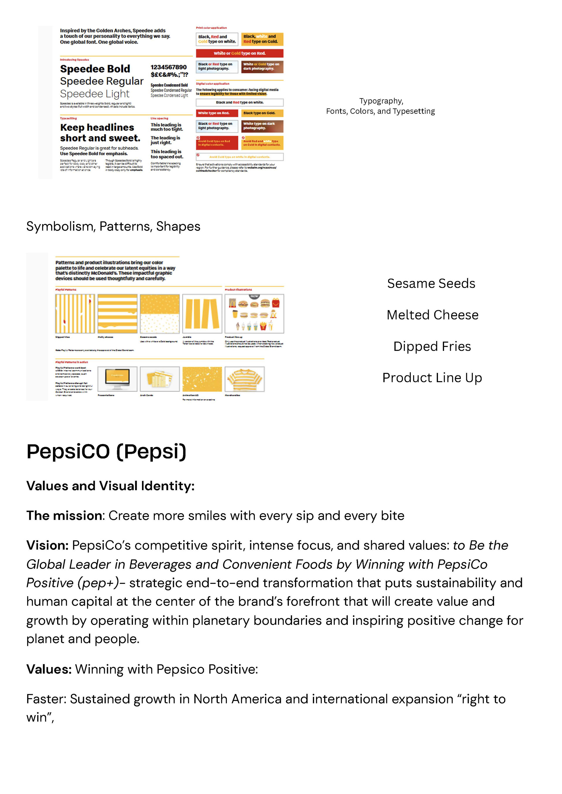
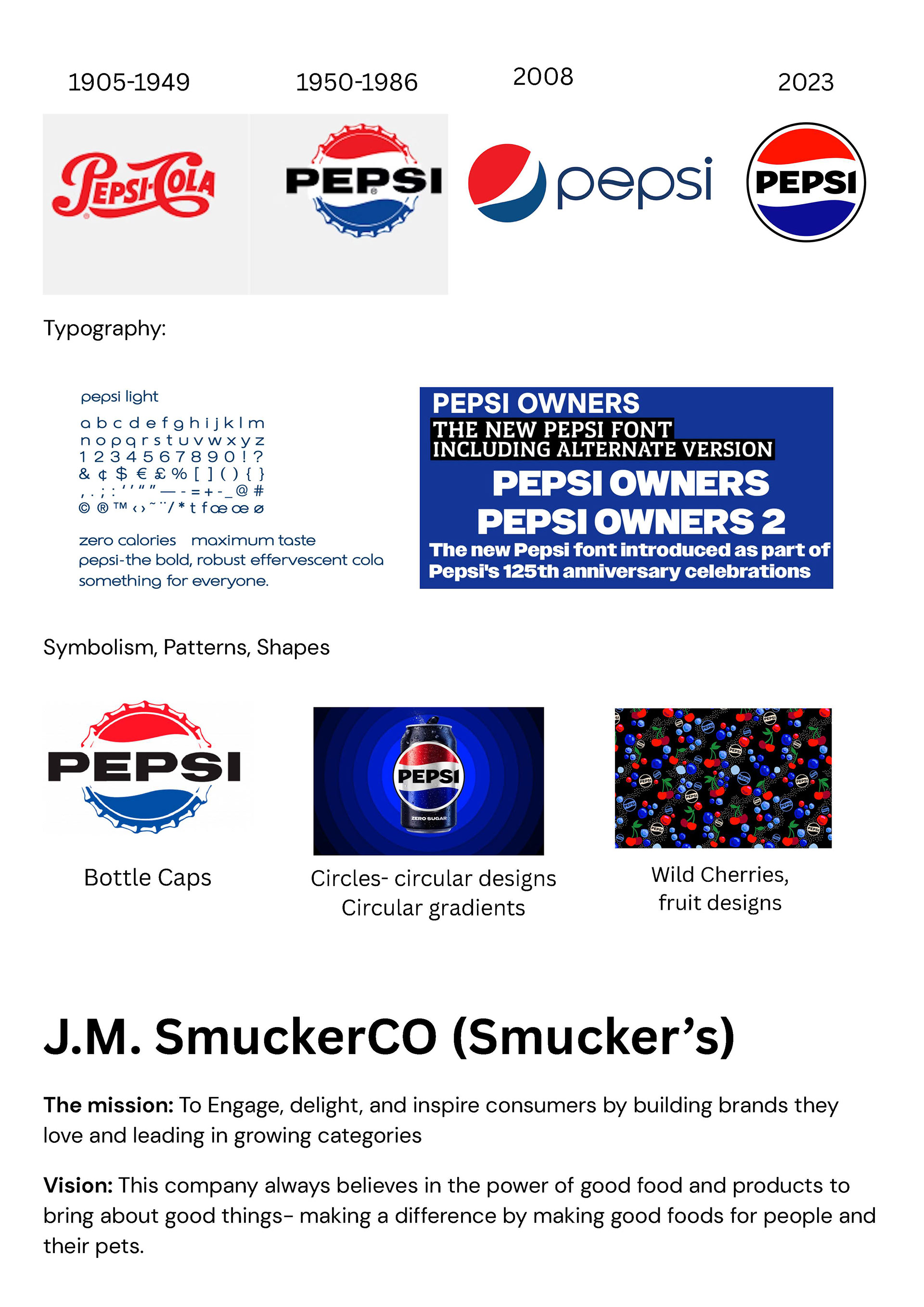
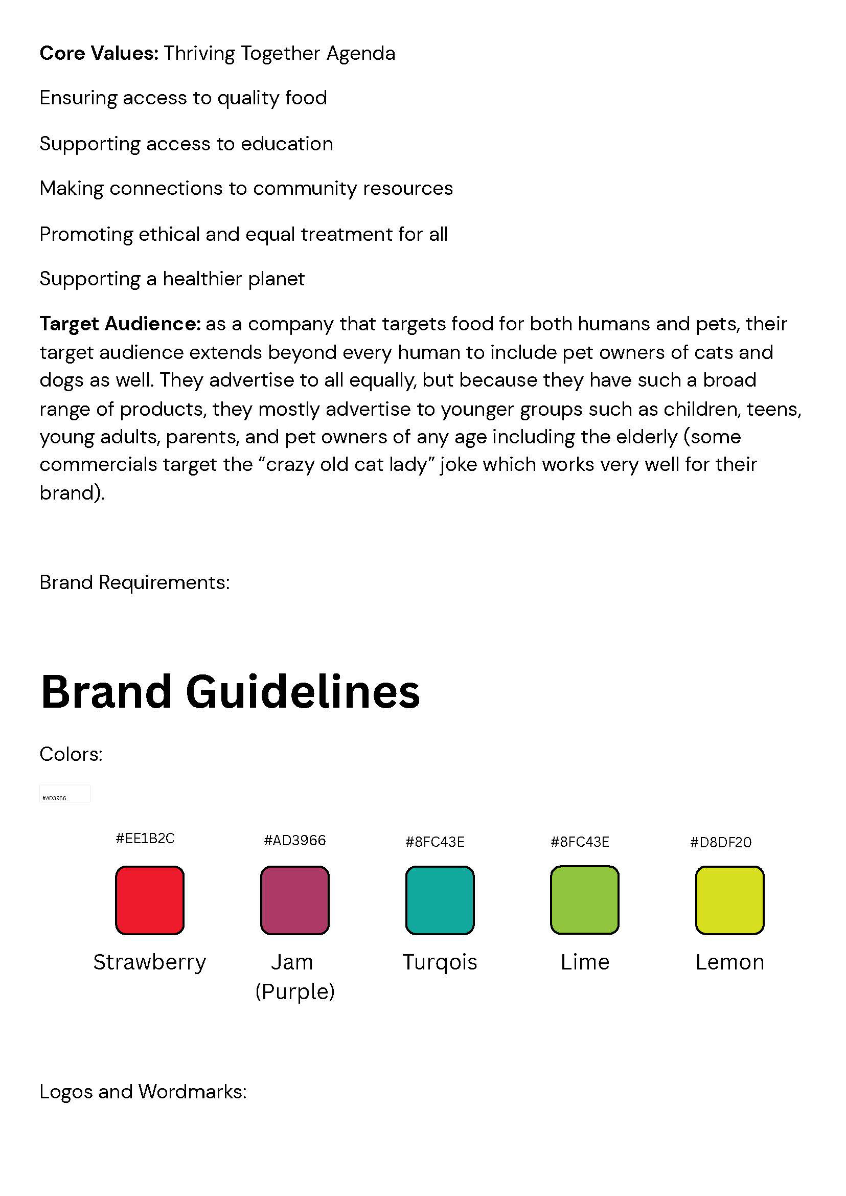
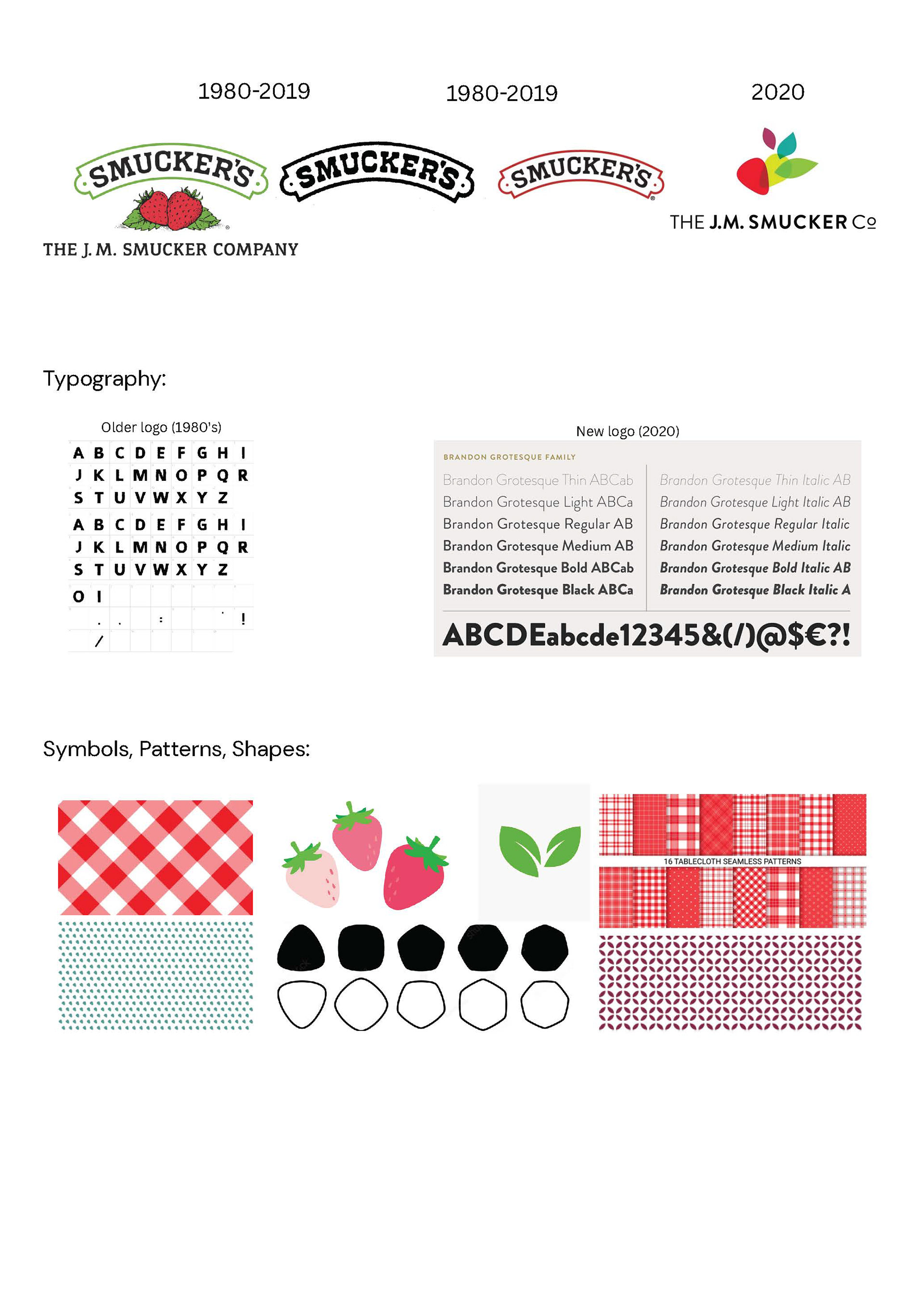
The first step was to create a creative brief and research successful brands and company logos, designs, branding elements, colors, and all the things that make that company stand out. Looking at companies such as McDonalds, Pepsi, and Smucker's success with colorful and bright looking designs that fit the atmosphere (like how Smucker's is country themed, and Pepsi is opting for a sleek and modern look). Then, a few mood boards were created with inspirations of art styles, type faces, colors, patterns, symbols, and other information or videos.
Mood Board
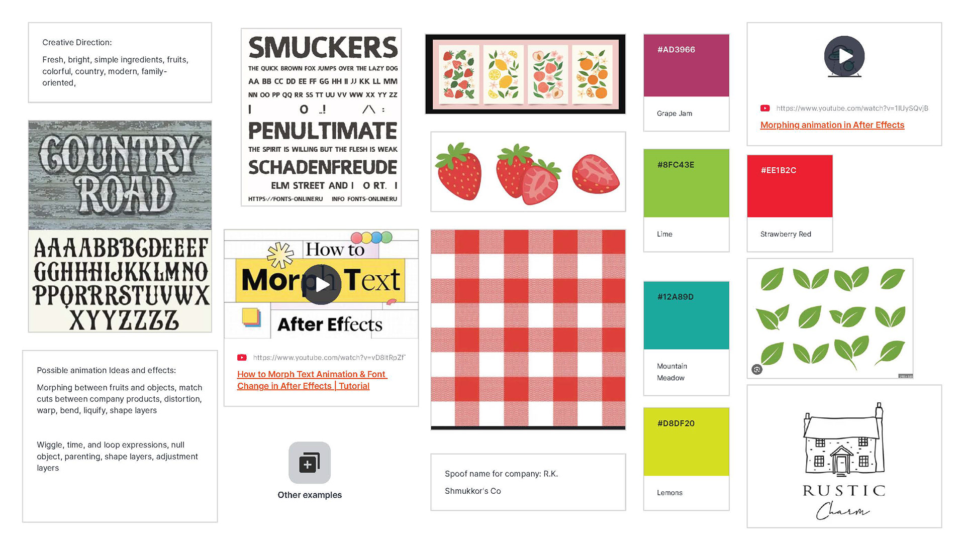
Mood board 1
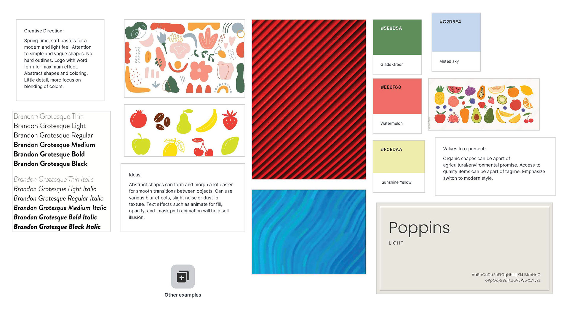
Mood board 2
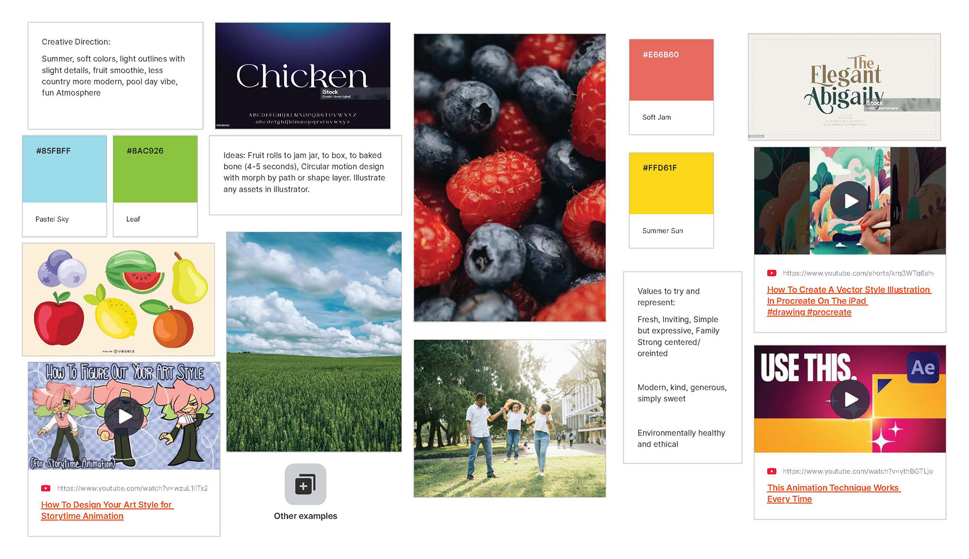
Mood board 3
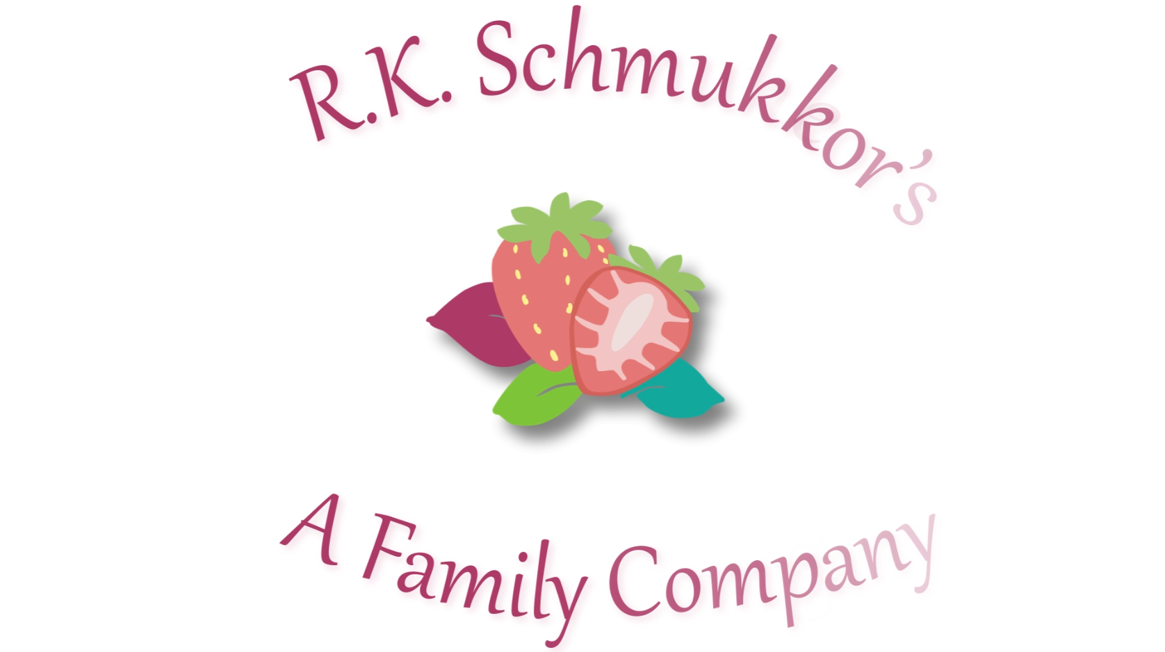
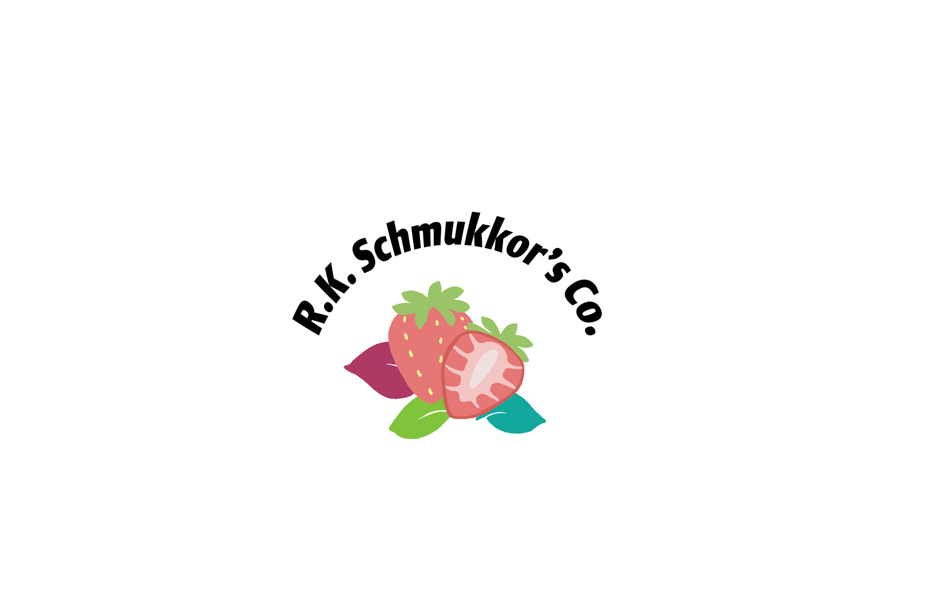
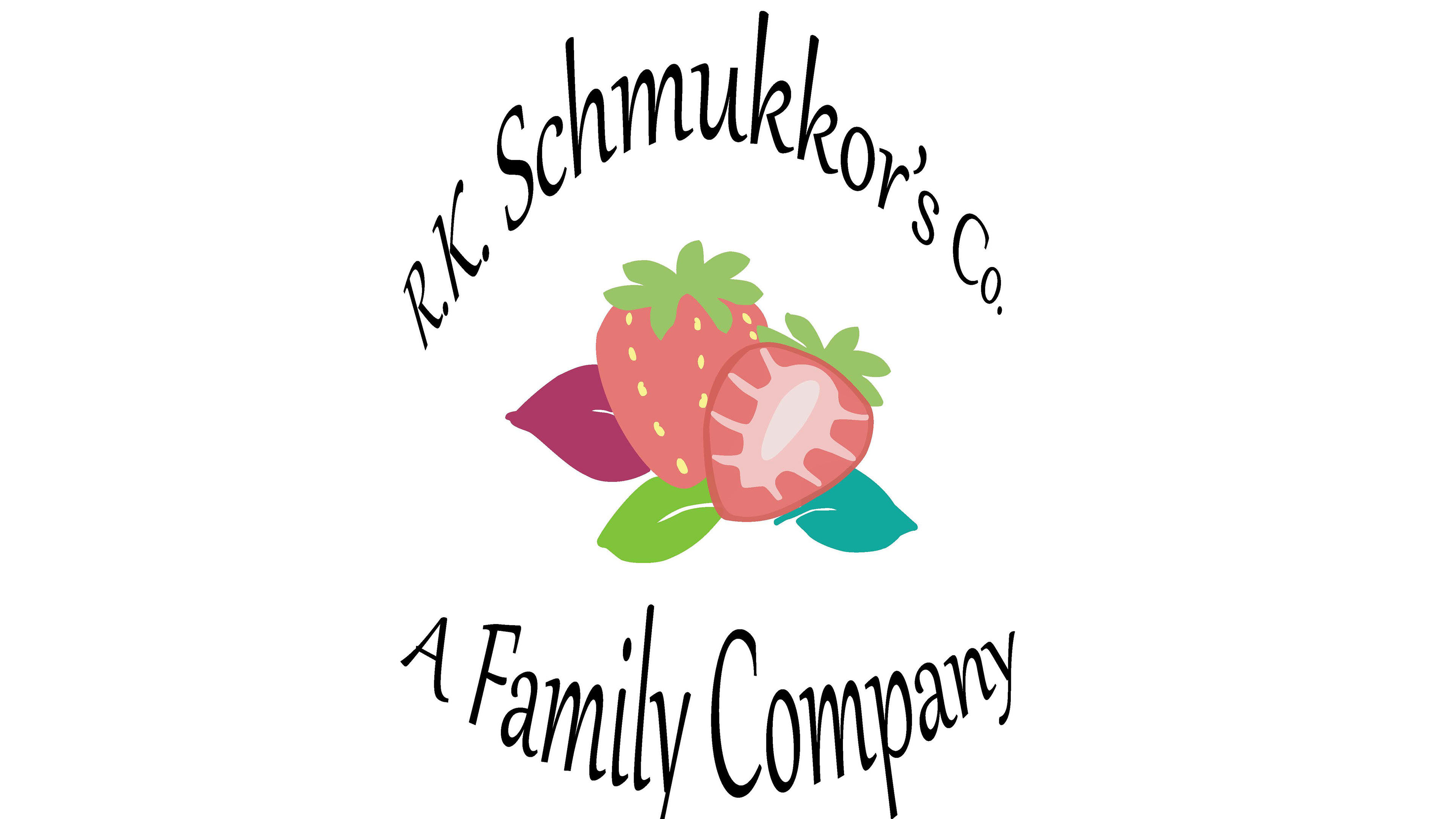
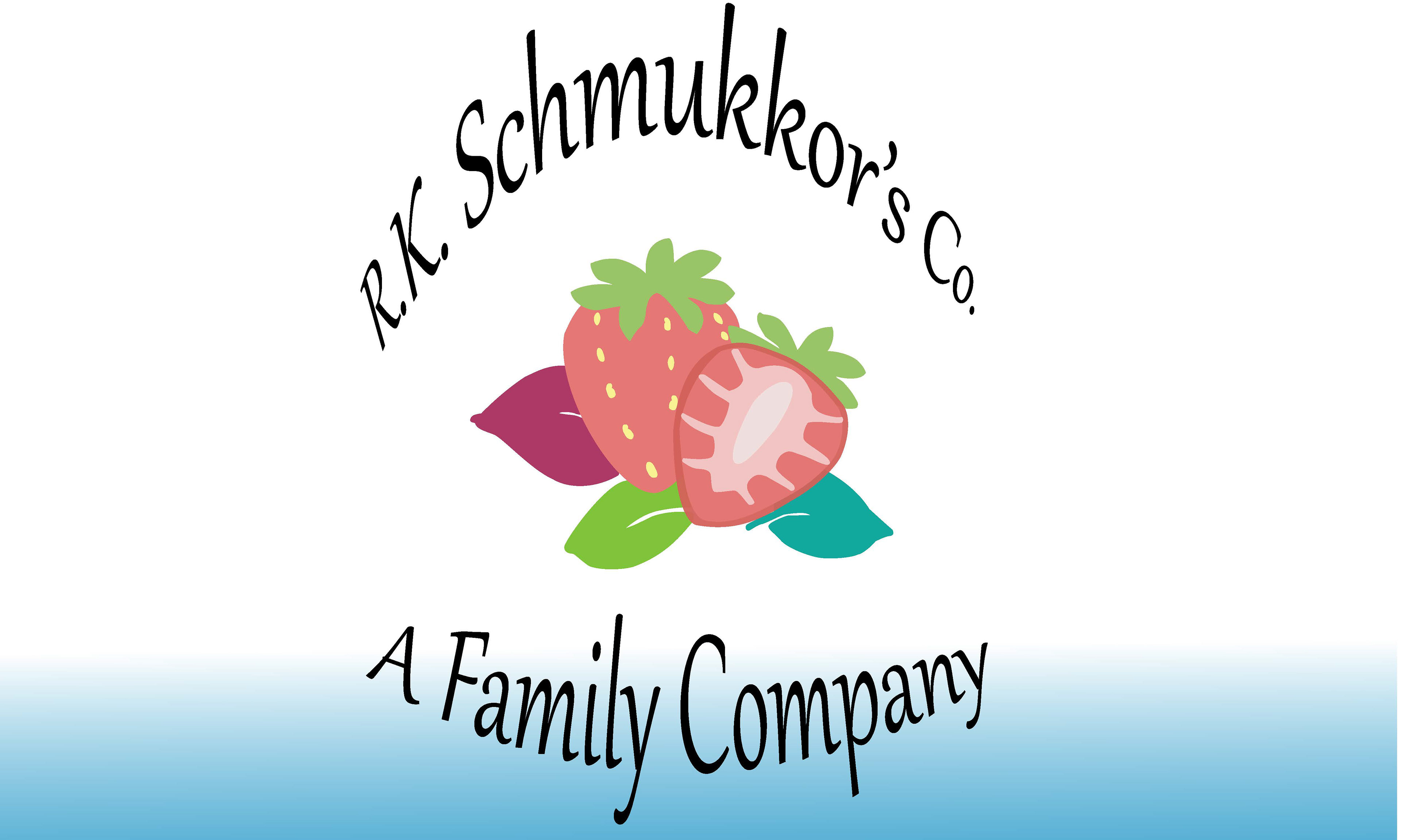
After doing all the research and pre-visualization work, I chose to do Smucker's corporate logo, which felt very modern and a little off the mark when looking at the company's recognizable typography and iconic strawberries. After reading about what other items and products are actually under Smucker's I decided to create a new logo that would still feature the fresh strawberries and utilized the corporate colors of green, maroon, and blue to try and encompass the whole company. Below are the various logo designs created.
Logo Designs
Logos 1
Logos 2
Once the logos were made, there were a few good possibilities but stuck to the first idea as it had decent structure and was similar to the brand atmosphere but different enough to not have any copyrighted issues. Using Photoshop, the design went through a slight process of edits to make a centered and visually interesting design.
Trial 1
Trial 2
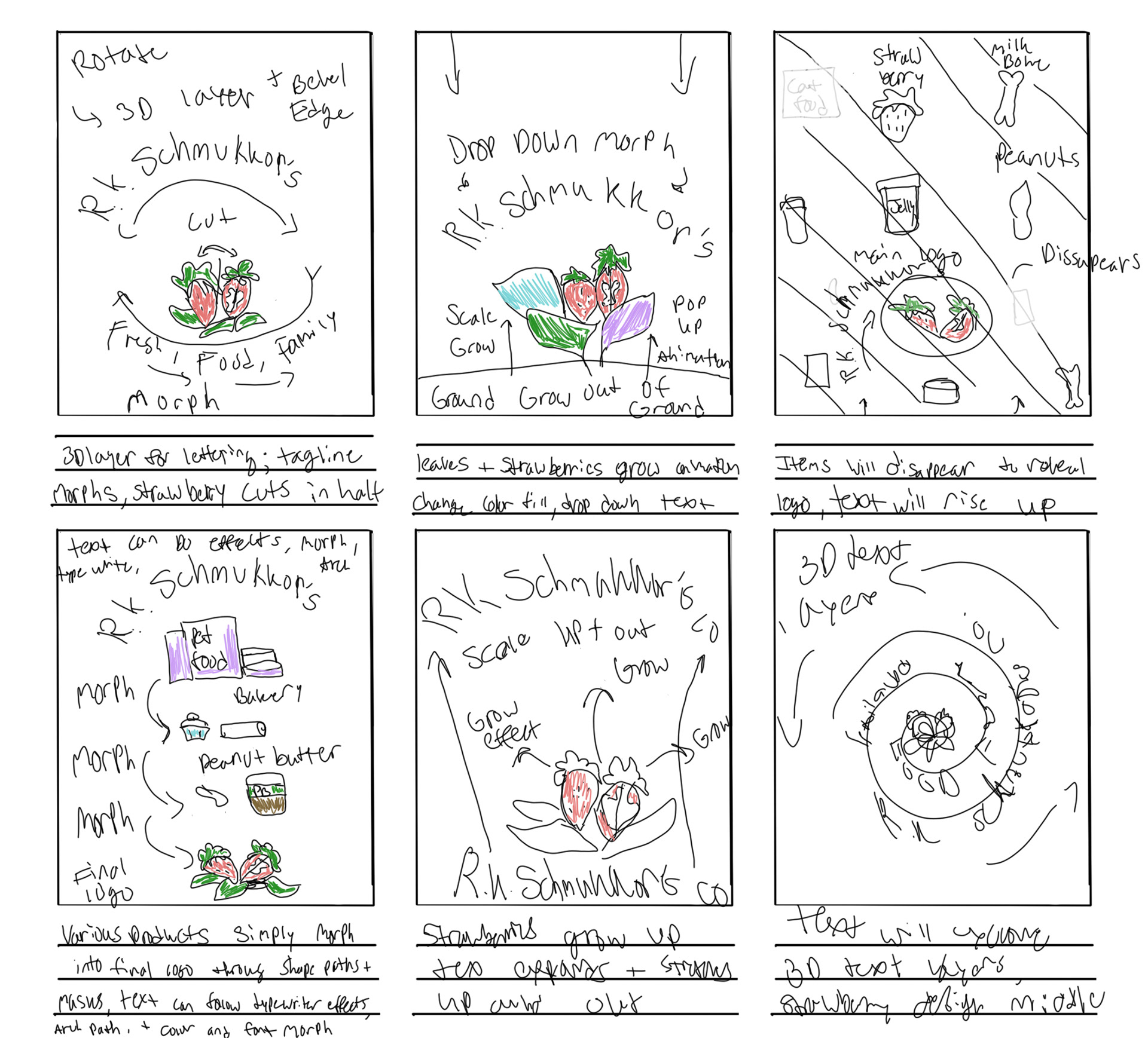
After peer review and feedback, the design was solidified and brought into Illustrator to then separate the layers for future animation within After Effects. The next portion was to start brainstorming for the video and logo animation itself. Storyboards were created to show off the different ways the logo and its animation would be tied to the company and the various products under the company.
Storyboard
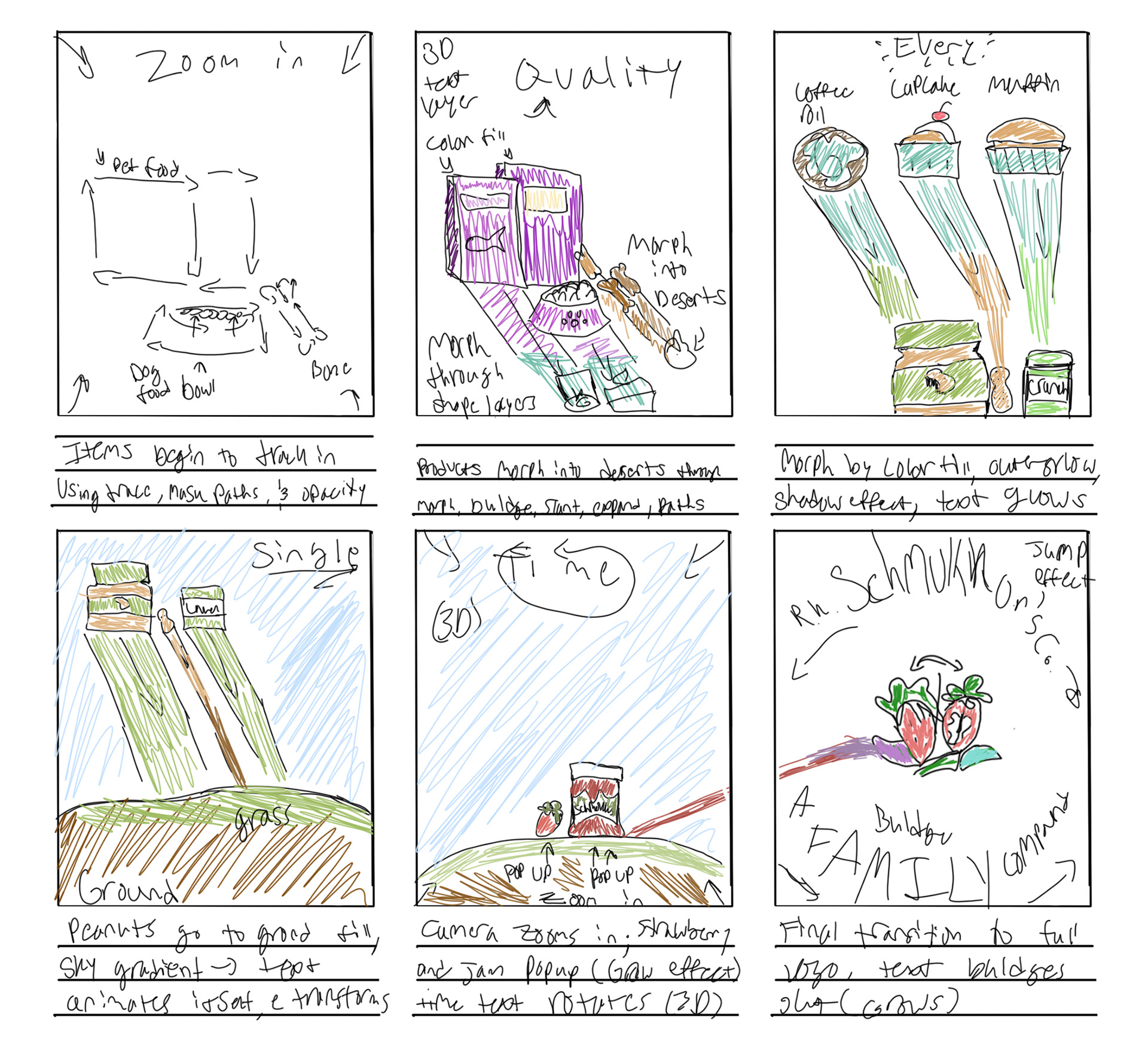
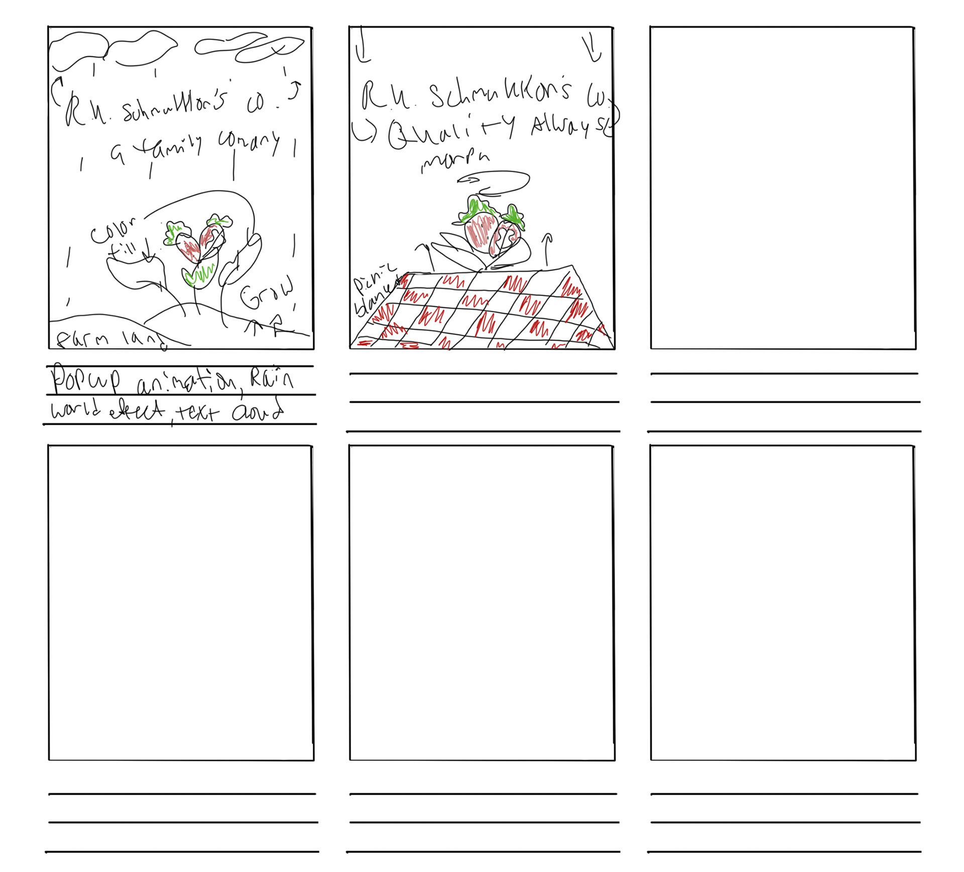
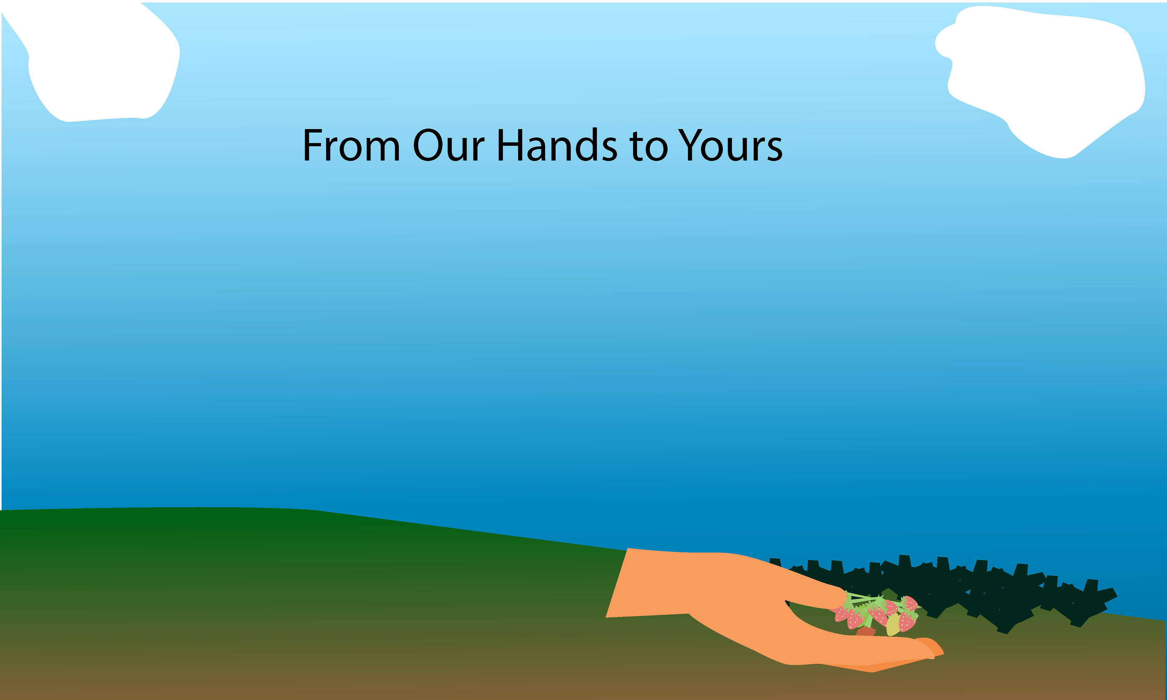
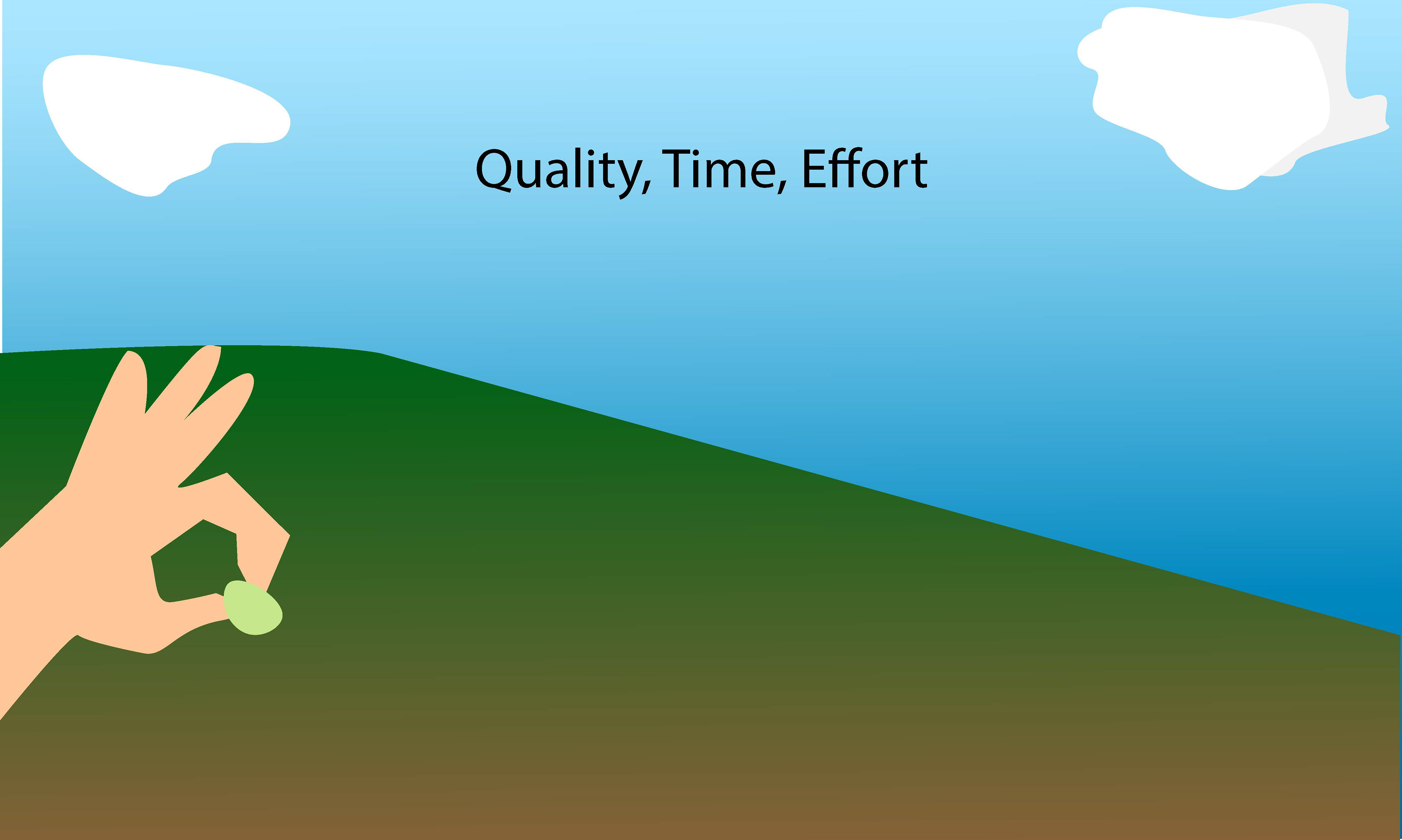
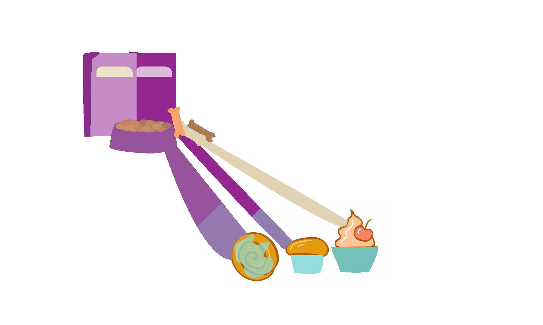
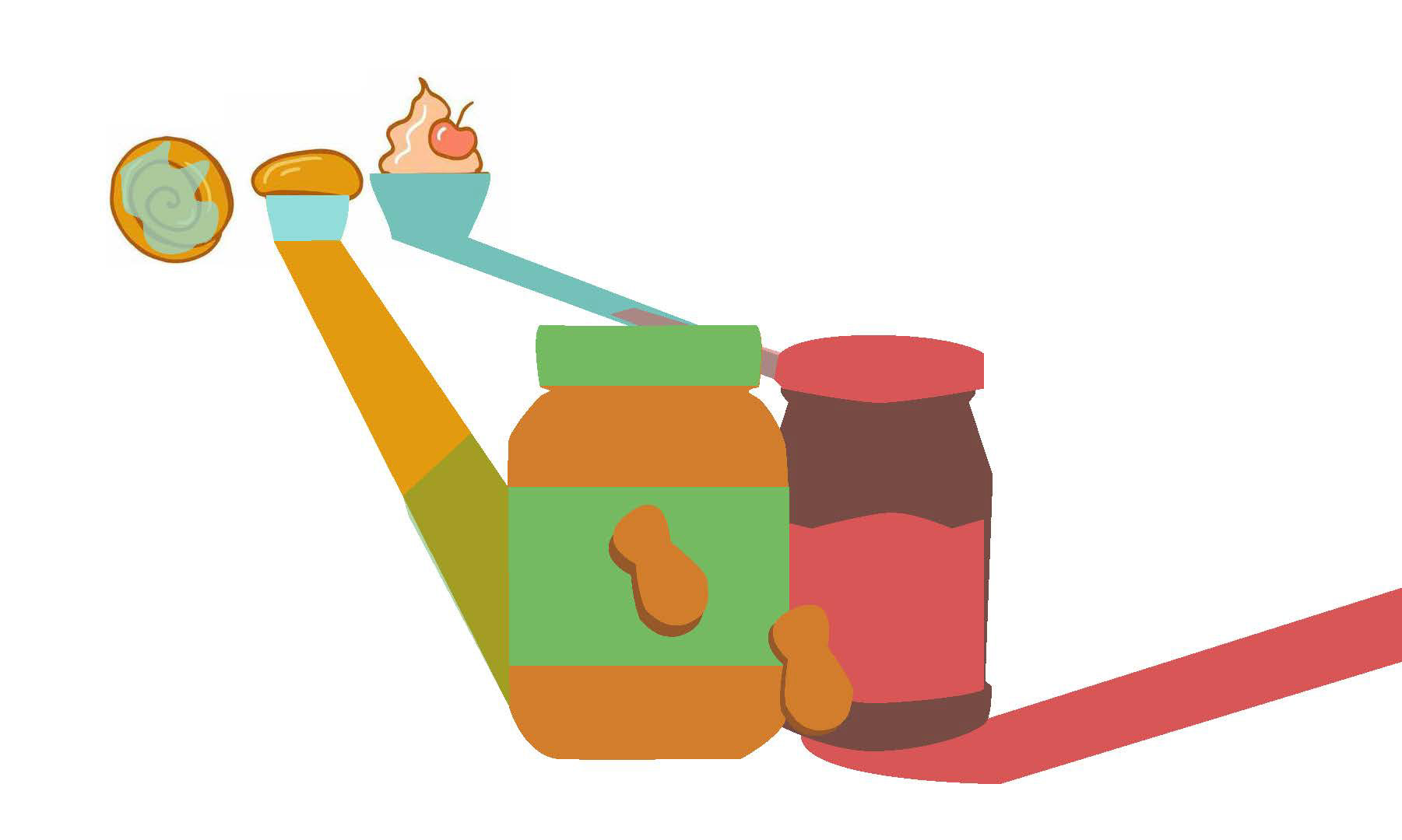
The storyboard did an alright job of showing the morphing elements and how they would transform into each other and eventually into the logo itself. For a proof of concept, style boards were created to further build on two possible concepts for the video and the animation. The first style board showed how the strawberries were picked and grown into the final logo. The second style board displayed the different products under the company and how each element would merge or morph into each other as the video goes on.
Style Boards
Style 1
Style 1, 2
Style 1, 3
Style 2
Style 2, 2
Style 2, 3
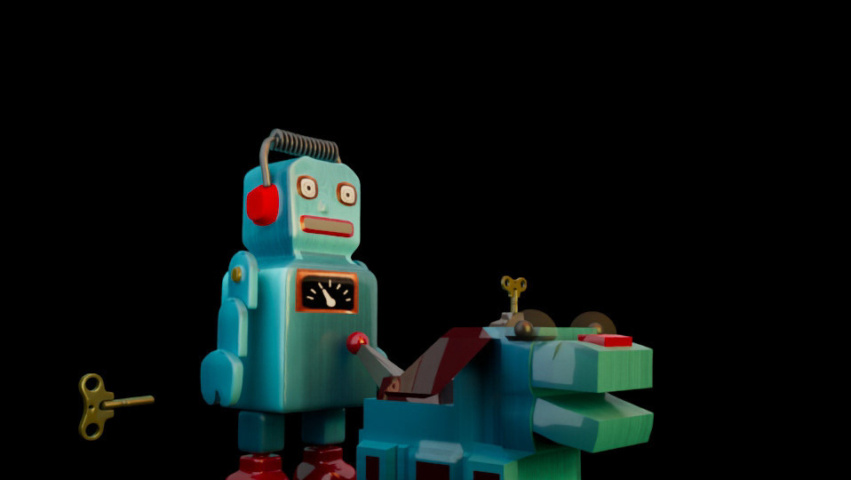
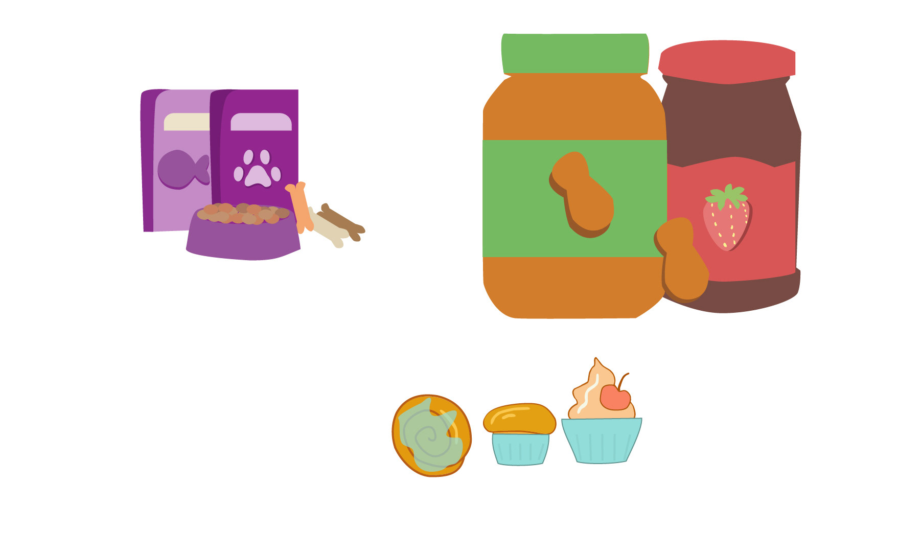
After generating a solid concept and proof of that concept, I took the second style board forward as the main focus of the video as it felt like a really complete design that included all the products from pet food and toys to bakery items to the iconic jam and peanut butters. Next, I took to Illustrator to create the graphic assets and export the layers for animation in After Effects.
Production
Once the assets were created and exported, the next segments of the project was all the animation aspects and morphing to be done within After Effects. The first draft render was a real test of what was working and not working in the video. The morph still looked extremely pre-mature and just did not make too much sense. The next render came out a bit better.
Draft Render 1
Draft 1
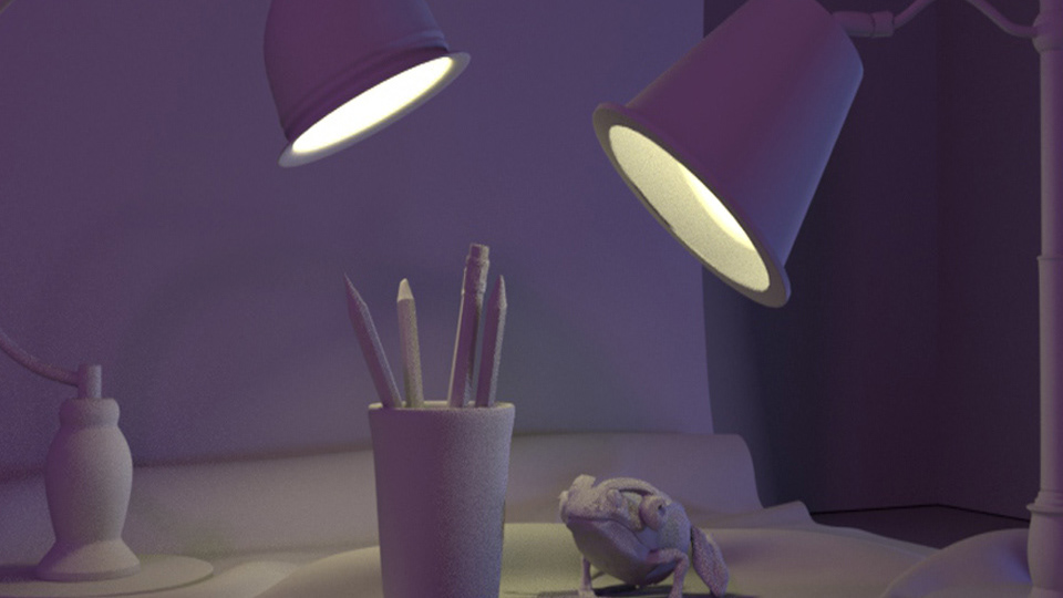
The next render test was to show some slight updates and changes. These changes included new line work for the assets to make them all look more alike and of the same style. the morph speed changed slightly along with the overall pacing of the changes and transformations. While this was a big step forward, the video and morph needed a lot more work to reach a professional level.
Draft Render 2
Draft 2
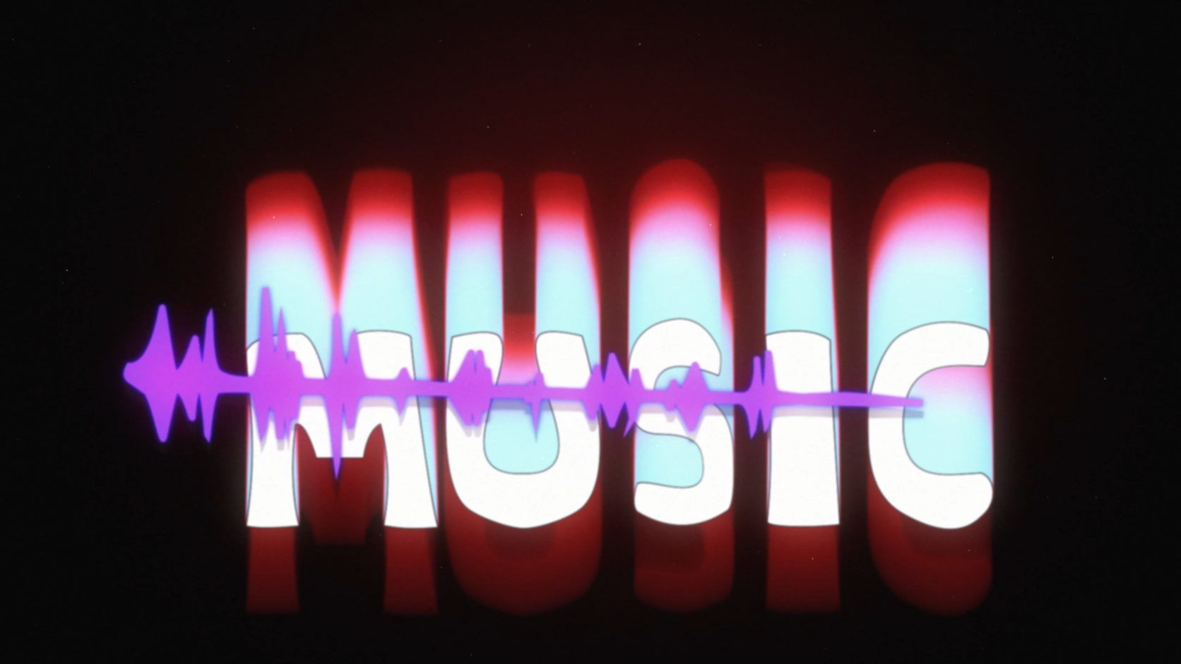
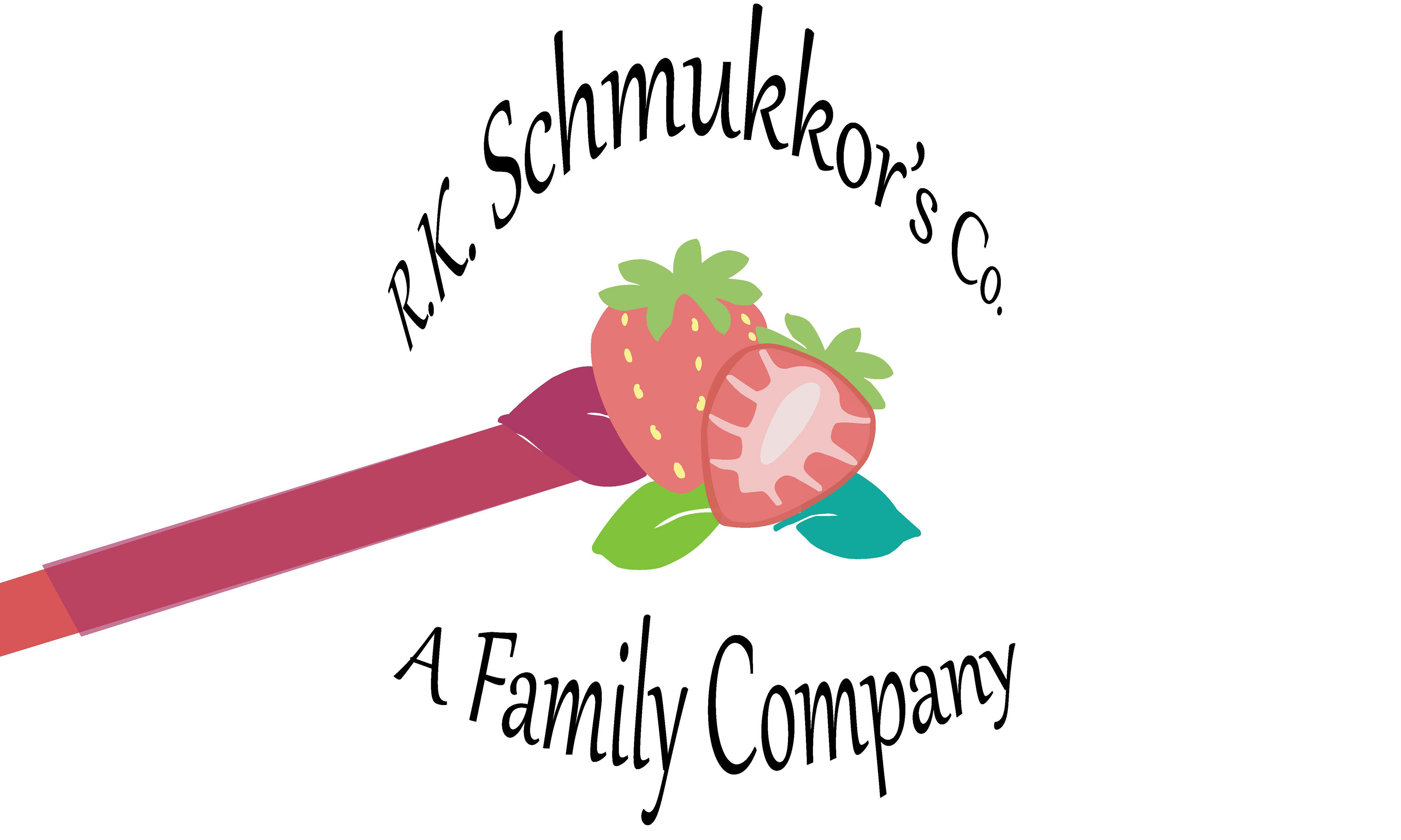
For the final edit, I went back in and tried to make the fluid shapes morph smoother without jagged shapes and more reflective of the item it was morphing into. The pacing was also elongated again along with a lot of tweak to the animation, camera angle, text effects, and transition timing. The product came out a lot better and finally looked professional enough to show off and be proud of.
Final Render
"J.M. Shmukkor's co. animation, After effects 2025, 1920 x 1080
After editing some of the aspects, I think this project can now stand on its own and feels a lot more polished than the other drafts and renders. I was super happy with the way the effects looked and the transitions feel a lot smoother in tandem with the music, branding, and overall atmosphere of the project.