Your World Your Way Title Sequence
The project goal was to create a new campaign for a new program: “Your World, Your
Way,” which focuses on unusual homes, and create the title sequence. This project aims to develop and brand the company, design a logo incorporating the program slogan (as mentioned above) and eventually develop the opening title sequence (roughly 20-22 seconds) for the program utilizing motion graphics, 3D models, and compositing of materials. I then went ahead and created a creative brief, researched the demo graphics, and then began creating a mood board of inspiration, resources, and other materials.
Way,” which focuses on unusual homes, and create the title sequence. This project aims to develop and brand the company, design a logo incorporating the program slogan (as mentioned above) and eventually develop the opening title sequence (roughly 20-22 seconds) for the program utilizing motion graphics, 3D models, and compositing of materials. I then went ahead and created a creative brief, researched the demo graphics, and then began creating a mood board of inspiration, resources, and other materials.
Mood Board
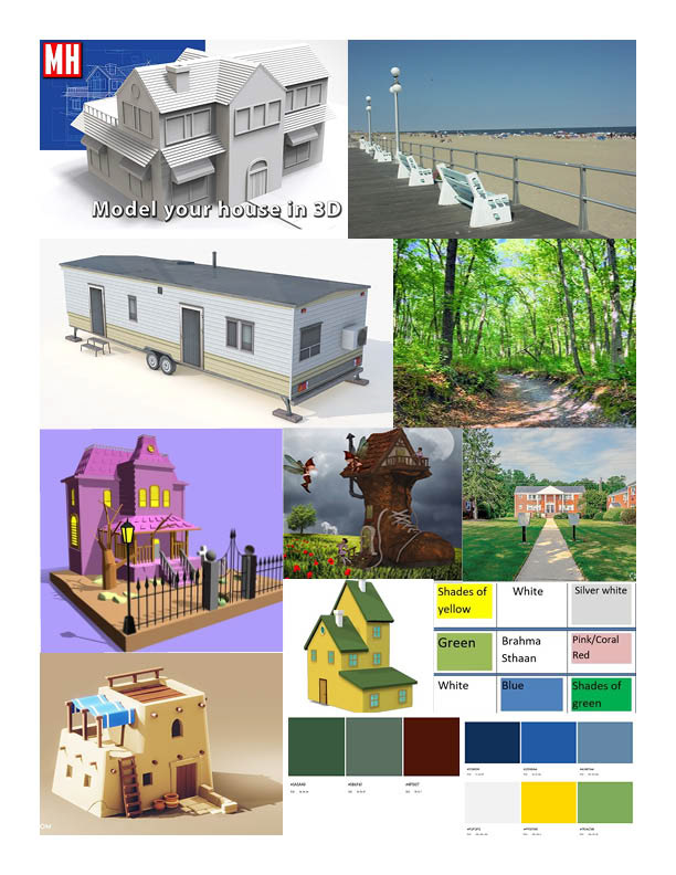
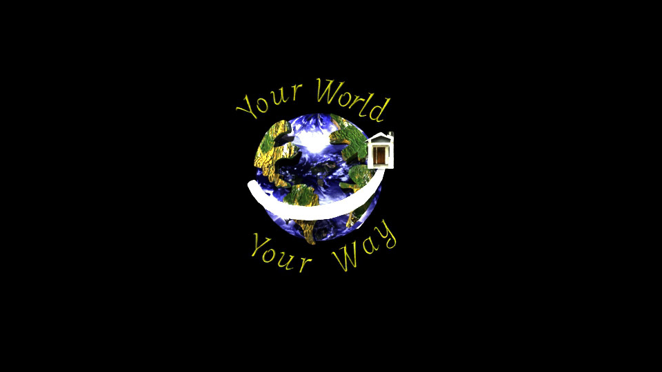
After gathering some inspiration for the kinds of footage and and houses that could be apart of the title sequence, I began the next phase by designing the logo that would brand the sequence. I wanted to design something all encompassing of the different homes, locations, and tag line that would fit the sequence best with the selected color scheme and art style. I ended up going with an earth themed logo to better appeal to the variety of potential audiences who would watch this program.
Logo Designs
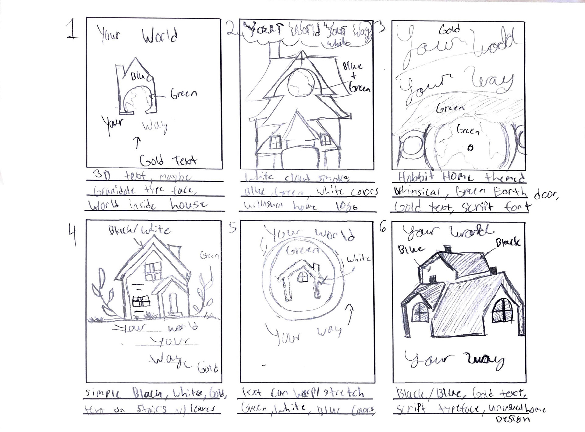
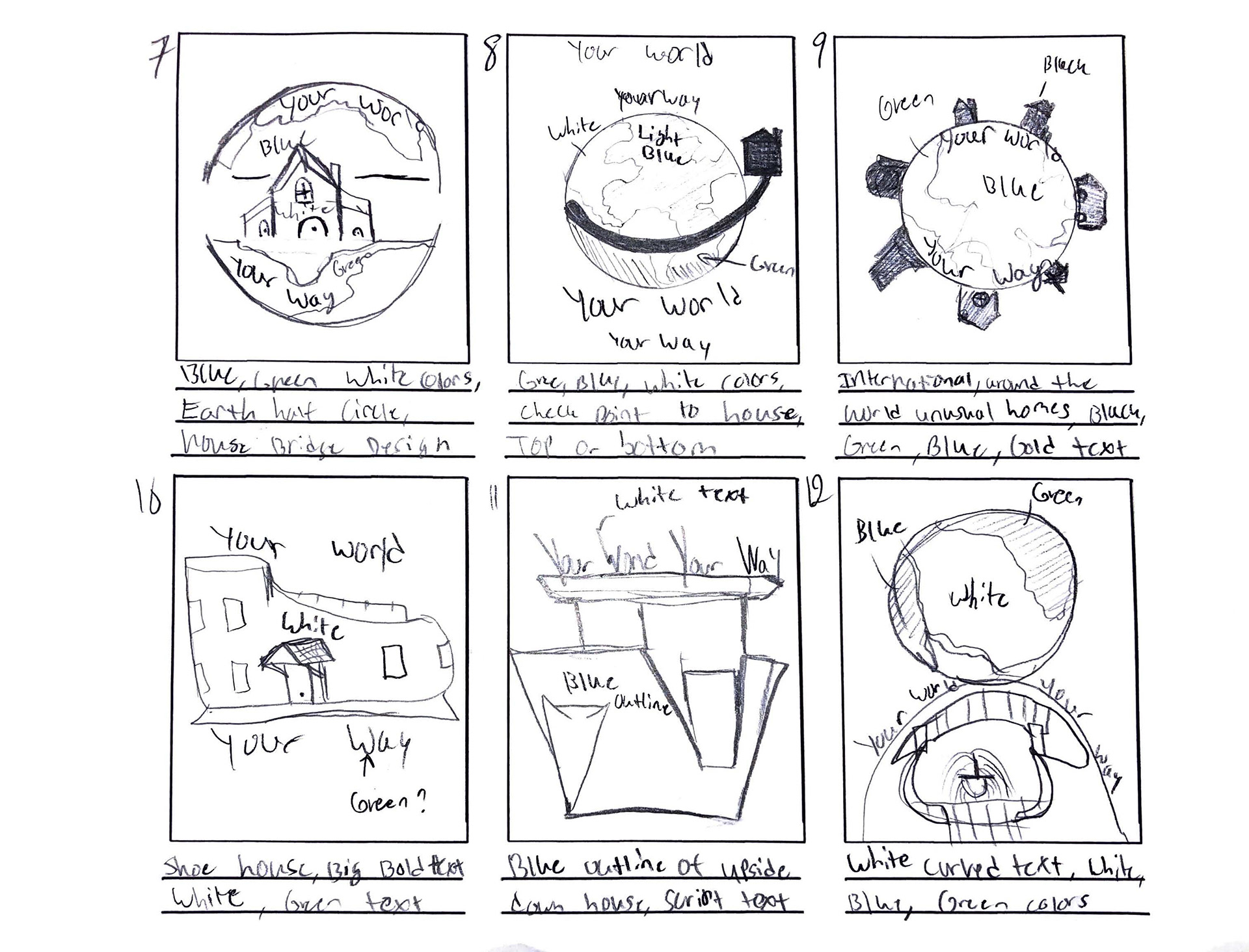
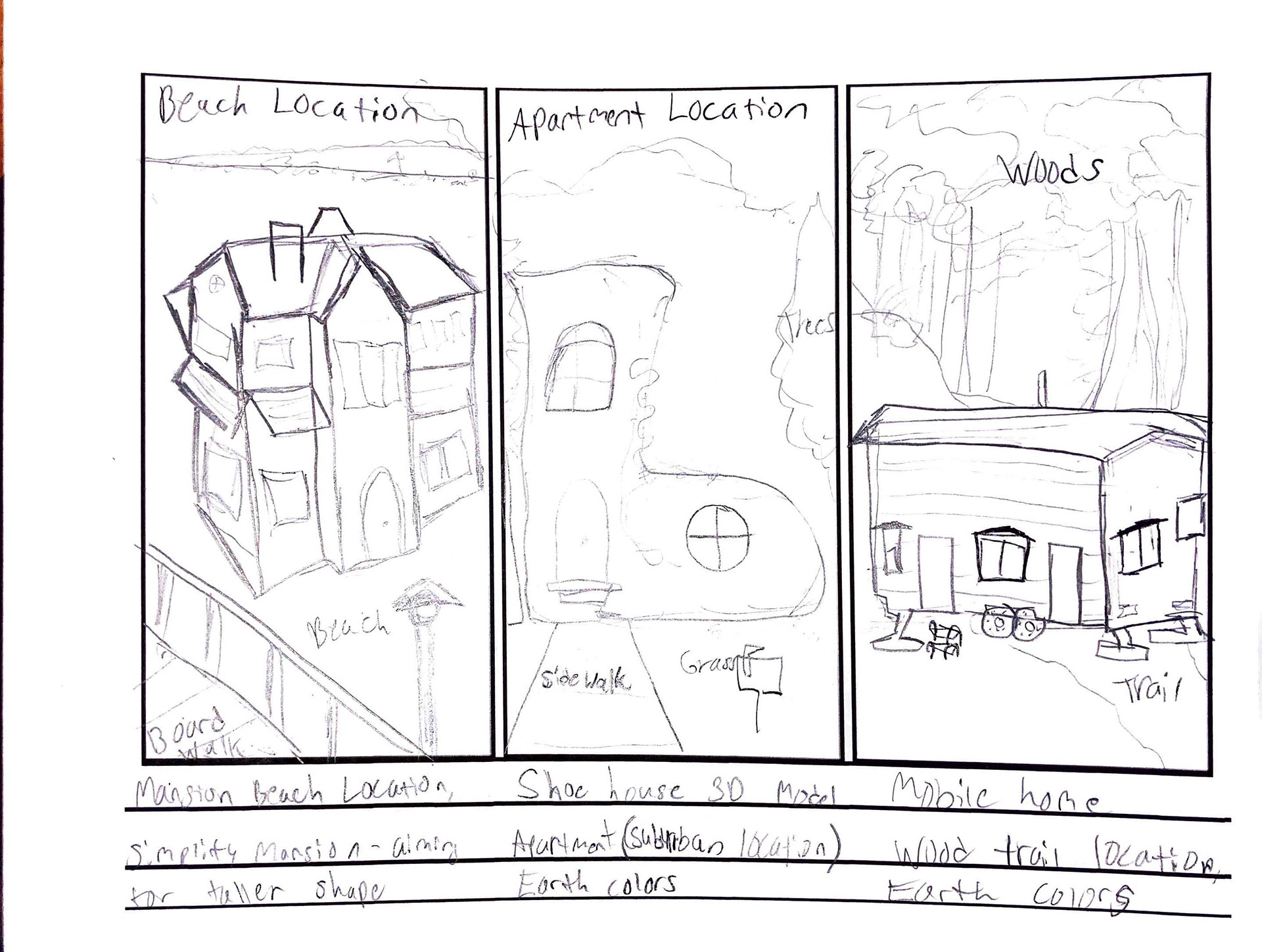
After configuring several designs, I chose the number eight panel as the best design that made the most sense, looked the cleanest, and did not have too many intricate details that would convert awkwardly between the 3D software Maya. I then went to create a storyboard to further cement the possible choices of location as this was another large portion of the project- collecting good footage by hand. This would help me envision where and how I could put the logo into the scenes and what types of houses would be appropriate for the location.
Story Board
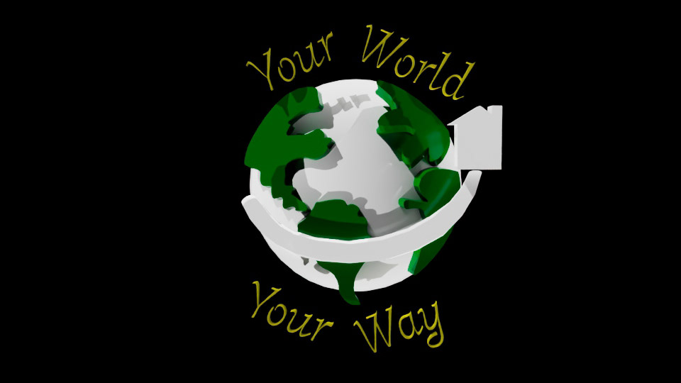
After drafting everything and having a good direction to start from, the next step was to draft the logo onto paper and transfer the design into Adobe Illustrator. The, I could take the full fledged design and convert the file to an SVG. format to then transfer it into Autodesk 3D program, Maya. I was able to make two versions, one without the color for the transfer, and the other with color to help me determine the appropriate texture I would later add.
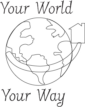
logo
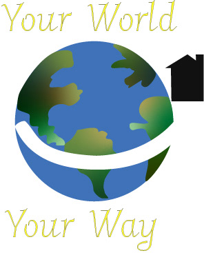
Logo color
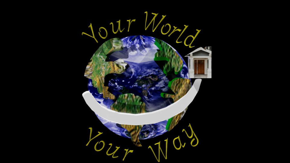
After creating and transferring the logo into a 3D model, it was time to start configuring an animation to make the logo pop and add some visual interest. I settled on a simple animation of the house revolving around the earth by sliding against the the swoop. I then also decided to use scale and position to make the continents look as though they are separating as the house moves across. I then began doing test renders of the animated logo and began applying basic textures.
Production
After creating the basic model and plotting out the animation key frames, I began testing more textures, exporting settings, and looking up compositing resources, so I could place this model into the footage I was going to shoot. At the time, the live link between Adobe After Effects and Maya was not working correctly. Thus, I ended up rendering out a Tiff sequence and compositing that into the footage instead as a work around.
Test Render 1
Test Logo 1
I decided to make the tag line rotate around the Earth to once again encompass the idea of a worldwide program that was global. However, the animations in this test render were very fast and felt too distracting as there were a lot of fast moving pieces that felt cluttered. After slowing down the frames and spacing out the animations, the render felt a lot better and more well paced. I then also imported a new texture for the earth and UV mapped the continental pieces to fix the distortion happening on the sides and top of the model.
Test Render 2
Test Logo 2
After cementing the animation and having the models feel more complete and solidified, the next portion was taking the footage and figuring out how to composite the logo into the footage. For the locations, I chose a street and the local outlet nearby, as these were the only local areas I could access and were the only footage spots that came out well enough for compositing.
Footage 1
Mall footage
I was able to take my iPhone to take the videos as I did not own a real or professional camera, thus the shots were slightly shaky and needed additional editing in Premiere Pro to fix these issues. I used a camera stabilizer effect as well as some much needed color effects to brighten up the scenes and add some visual atmosphere.
Footage 2
Outside Walkway
For this footage, I was able to head to my local shopping outlet at night as I planned to have the footage mesh together through an opacity feature. I also caught the moving map board and was able to get points on that sign to composite an additional logo there, and enhance the glowing lights.
Test Full Render
Full Video Test Render
After gathering all the materials together, it was time to composite the items into the footage and begin adding typography, special effects, sound design, and color correction methods. The first draft came out decently as the track matte helped use another video scene to help stand out against the background footage. The major issue was that the second portion of the video felt empty and blank and the side wall composite was not clear enough to see- thus, some changes and edits had to be made to make a more dynamic and complex scene.
Test Full Render 2
Full Render Test 2
I then added in the secondary logo onto the screen and added in a snowfall effect to help liven up the scene. While this felt like a big step up in terms of visual appeal, I still felt like i had more to do to create a better final product. So, I went back in to revise. then felt polished, interesting, visually engaging, and showed of the capacity to composite moving items together.
Final Product
Your World Your Way, After Effects 2025, 720 x 1280
I made a lot of edits in this version including tweaks to the composite of the logo, added in new composited text for the shop top and wall while also tackling the background logo composite. After making a lot of different tweaks, adding new glow effects, and adding in text elements helped the video reach a new direction that supports its title sequence role.